#跟着若城学鸿蒙# UI组件篇-Popup及其属性
Popup组件从API Version 11开始支持,并可在原子化服务中使用。根据文档内容,Popup是用于显示特定样式气泡的组件,建议开发者结合Popup控制中提供的自定义气泡功能一起使用。通过CustomPopupOptions的builder可以创建完全自定义的气泡内容:@Entry@Component@Builderbuild() {Column() {})// 气泡的内容// 气泡的弹出
Popup组件是ArkUI框架中用于显示特定样式气泡的重要UI组件,它可以自定义图标、标题、内容和按钮等样式,广泛应用于各种交互场景中。本文将全面介绍Popup组件的功能特性、使用方法以及实际应用案例。
Popup组件概述
Popup组件从API Version 11开始支持,并可在原子化服务中使用。根据文档内容,Popup是用于显示特定样式气泡的组件,建议开发者结合Popup控制中提供的自定义气泡功能一起使用。
基本导入方式
要使用Popup组件,首先需要导入相关模块:
import { Popup, PopupOptions, PopupTextOptions, PopupButtonOptions, PopupIconOptions } from '@kit.ArkUI'; 组件特点
- 可定制性强:支持自定义图标、标题、内容和按钮样式
- 灵活布局:可以设置不同方向显示
- 交互丰富:支持按钮点击事件和关闭回调
- 多场景适用:可用于提示、确认、操作引导等多种场景
Popup组件核心API
Popup装饰器
Popup(options: PopupOptions): void 装饰器类型:@Builder
原子化服务API:从API version 12开始,该接口支持在原子化服务中使用。
系统能力:SystemCapability.ArkUI.ArkUI.Full
参数:
| 参数名 | 类型 | 必填 | 说明 |
|---|---|---|---|
| options | PopupOptions | 是 | 定义Popup组件的类型。 |
PopupOptions参数
PopupOptions定义了Popup的具体式样参数:
interface PopupOptions { icon?: PopupIconOptions; title?: PopupTextOptions; message: PopupTextOptions; showClose?: boolean | Resource; onClose?: () => void; buttons?: [PopupButtonOptions?, PopupButtonOptions?]; direction12+?: Direction; } 原子化服务API:从API version 12开始,该接口支持在原子化服务中使用。
系统能力:SystemCapability.ArkUI.ArkUI.Full
| 名称 | 类型 | 必填 | 说明 |
|---|---|---|---|
| icon | PopupIconOptions | 否 | 设置popup图标。说明:当size设置异常值或0时不显示。 |
| title | PopupTextOptions | 否 | 设置popup标题文本。 |
| message | PopupTextOptions | 是 | 设置popup内容文本。说明:message不支持设置fontWeight。 |
| showClose | boolean | Resource | 否 | 设置popup关闭按钮。默认值:true |
| onClose | () => void | 否 | 设置popup关闭按钮回调函数。 |
| buttons | [PopupButtonOptions?,PopupButtonOptions?] | 否 | 设置popup操作按钮,按钮最多设置两个。 |
| direction12+ | Direction | 否 | 布局方向。默认值:Direction.Auto |
PopupTextOptions文本样式
interface PopupTextOptions { text: ResourceStr; fontSize?: number | string | Resource; fontColor?: ResourceColor; fontWeight?: number | FontWeight | string; } 原子化服务API:从API version 12开始,该接口支持在原子化服务中使用。
系统能力:SystemCapability.ArkUI.ArkUI.Full
| 名称 | 类型 | 必填 | 说明 |
|---|---|---|---|
| text | ResourceStr | 是 | 设置文本内容。 |
| fontSize | number | string | Resource | 否 | 设置文本字体大小。默认值:$r('sys.float.ohos_id_text_size_body2') string类型可选值:可以转化为数字的字符串(如'10')或带长度单位的字符串(如'10px'),不支持设置百分比字符串。number:取值范围(0,+∞)。 |
| fontColor | ResourceColor | 否 | 设置文本字体颜色。默认值:$r('sys.color.ohos_id_color_text_secondary') |
| fontWeight | number | FontWeight | string | 否 | 设置文本字体粗细。number类型取值[100,900],取值间隔为100,默认为400,取值越大,字体越粗。string类型仅支持number类型取值的字符串形式,例如"400",以及"bold"、"bolder"、"lighter"、"regular"、"medium"分别对应FontWeight中相应的枚举值。默认值:FontWeight.Regular |
PopupButtonOptions按钮选项
interface PopupButtonOptions { text: ResourceStr; action?: () => void; fontSize?: number | string | Resource; fontColor?: ResourceColor; } 原子化服务API:从API version 12开始,该接口支持在原子化服务中使用。
系统能力:SystemCapability.ArkUI.ArkUI.Full
| 名称 | 类型 | 必填 | 说明 |
|---|---|---|---|
| text | ResourceStr | 是 | 设置按钮内容。 |
| action | () => void | 否 | 设置按钮click回调。 |
| fontSize | number | string | Resource | 否 | 设置按钮文本字体大小。默认值:$r('sys.float.ohos_id_text_size_button2') |
| fontColor | ResourceColor | 否 | 设置按钮文本字体颜色。默认值:$r('sys.color.ohos_id_color_text_primary_activated') |
PopupIconOptions图标选项
interface PopupIconOptions { image: ResourceStr; width?: Dimension; height?: Dimension; fillColor?: ResourceColor; borderRadius?: Length | BorderRadiuses; } 原子化服务API:从API version 12开始,该接口支持在原子化服务中使用。
系统能力:SystemCapability.ArkUI.ArkUI.Full
| 名称 | 类型 | 必填 | 说明 |
|---|---|---|---|
| image | ResourceStr | 是 | 设置图标内容。 |
| width | Dimension | 否 | 设置图标宽度。默认值:32VP |
| height | Dimension | 否 | 设置图标高度。默认值:32VP |
| fillColor | ResourceColor | 否 | 设置图标填充颜色。说明:仅针对svg图源生效。 |
| borderRadius | Length | BorderRadiuses | 否 | 设置图标圆角。默认值:$r('sys.float.ohos_id_corner_radius_default_s') |
Popup组件使用示例
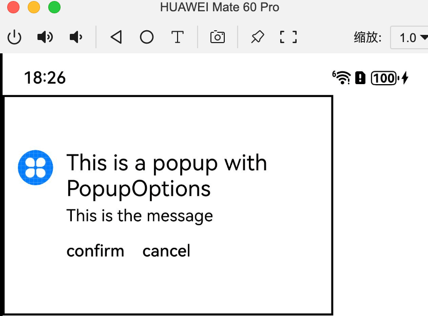
示例1:设置气泡样式
该示例通过配置PopupIconOptions、PopupTextOptions、PopupButtonOptions实现气泡的样式。
import { Popup, PopupTextOptions, PopupButtonOptions, PopupIconOptions } from '@kit.ArkUI';

@Entry
@Component
struct PopupExample {
  build() {
    Row() { // popup 自定义高级组件
      Popup({
        // PopupIconOptions类型设置图标内容
        icon: {
          image: $r('app.media.icon'),
          width: 32,
          height: 32,
          fillColor: Color.White,
          borderRadius: 16
        } as PopupIconOptions,
        // PopupTextOptions类型设置文字内容
        title: {
          text: 'This is a popup with PopupOptions',
          fontSize: 20,
          fontColor: Color.Black,
          fontWeight: FontWeight.Normal
        } as PopupTextOptions,
        // PopupTextOptions类型设置文字内容
        message: { text: 'This is the message', fontSize: 15, fontColor: Color.Black } as PopupTextOptions,
        showClose: false,
        onClose: () => {
          console.info('close Button click')
        },
        // PopupButtonOptions类型设置按钮内容
        buttons: [{
          text: 'confirm',
          action: () => {
            console.info('confirm button click')
          },
          fontSize: 15,
          fontColor: Color.Black,
        }, {
          text: 'cancel',
          action: () => {
            console.info('cancel button click')
          },
          fontSize: 15,
          fontColor: Color.Black
        },] as [PopupButtonOptions?, PopupButtonOptions?]
      })
    }.width(300).height(200).borderWidth(2).justifyContent(FlexAlign.Center)
  }
}
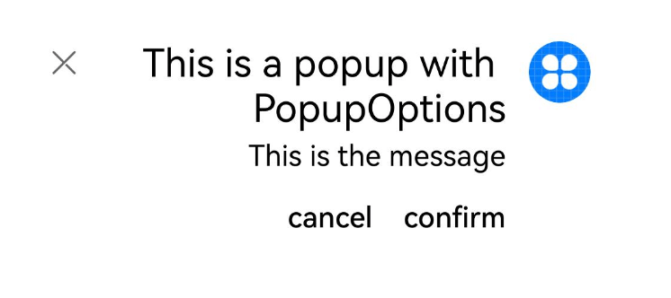
示例2:设置镜像效果
该示例通过配置direction实现Popup的镜像效果。
import { Popup, PopupTextOptions, PopupButtonOptions, PopupIconOptions } from '@kit.ArkUI'

@Entry
@Component
struct PopupPage {
  @State currentDirection: Direction = Direction.Rtl

  build() {
    Column() {
      Popup({
        direction: this.currentDirection,
        icon: {
          image: $r('app.media.icon'),
          width: 32,
          height: 32,
          fillColor: Color.White,
          borderRadius: 16,
        } as PopupIconOptions,
        title: {
          text: 'This is a popup with PopupOptions',
          fontSize: 20,
          fontColor: Color.Black,
          fontWeight: FontWeight.Normal,
        } as PopupTextOptions,
        message: { text: 'This is the message', fontSize: 15, fontColor: Color.Black, } as PopupTextOptions,
        showClose: true,
        onClose: () => {
          console.info('close Button click')
        },
        buttons: [{
          text: 'confirm',
          action: () => {
            console.info('confirm button click')
          },
          fontSize: 15,
          fontColor: Color.Black,
        }, {
          text: 'cancel',
          action: () => {
            console.info('cancel button click')
          },
          fontSize: 15,
          fontColor: Color.Black,
        },] as [PopupButtonOptions?, PopupButtonOptions?],
      })
    }.justifyContent(FlexAlign.Center).width('100%').height('100%')
  }
} 
Popup与其他弹窗组件的比较
在ArkUI中,除了Popup组件外,还有其他几种弹窗组件,它们各自适用于不同的场景:
| 弹窗名称 | 应用场景 | 特点 |
|---|---|---|
| 弹出框(Dialog) | 需要用户关注的重要信息或操作 | 模态窗口,必须用户交互才能关闭 |
| 菜单控制(Menu) | 给指定组件绑定用户可执行的操作 | 支持右键或长按触发 |
| 气泡提示(Popup) | 给指定组件提供提示信息 | 非模态,可自定义样式 |
| 绑定模态页面 | 新界面覆盖旧界面但不消失 | 用于图片查看等场景 |
| 即时反馈(Toast) | 操作简单反馈 | 自动消失,不干扰用户 |
| 设置浮层(OverlayManager) | 完全自定义内容 | 悬浮球/胶囊等特殊效果 |
Popup组件的进阶用法
结合bindPopup使用
bindPopup是另一种使用Popup的方式,可以为组件绑定Popup弹窗:
bindPopup(show: boolean, popup: PopupOptions | CustomPopupOptions) 原子化服务API:从API version 11开始,该接口支持在原子化服务中使用。
系统能力:SystemCapability.ArkUI.ArkUI.Full
参数:
| 参数名 | 类型 | 必填 | 说明 |
|---|---|---|---|
| show | boolean | 是 | 弹窗显示状态,默认值为false,隐藏弹窗。popup弹窗必须等待页面全部构建完成才能展示,因此show不能在页面构建中设置为true,否则会导致popup弹窗显示位置及形状错误。该参数从API Version 13开始支持!!语法双向绑定变量。 |
| popup | PopupOptions | CustomPopupOptions8+ | 是 |
示例:
@Entry
@Component
struct BindPopupDemo {
@State customPopup: boolean = false;
@Builder
popupBuilder() {
Column({ space: 2 }) {
Row().width(64).height(64).backgroundColor(0x409eff)
Text('Popup').fontSize(10).fontColor(Color.White)
}.justifyContent(FlexAlign.SpaceAround).width(100).height(100).padding(5)
}
build() {
Column() {
Button('click')
.onClick(() => {
this.customPopup = !this.customPopup;
})
.backgroundColor(0xf56c6c)
.bindPopup(this.customPopup, {
builder: this.popupBuilder,
placement: Placement.Top,
maskColor: 0x33000000,
popupColor: 0xf56c6c,
enableArrow: true,
onStateChange: (e) => {
if (!e.isVisible) {
this.customPopup = false;
}
}
})
}.justifyContent(FlexAlign.Center).width('100%').height(437)
}
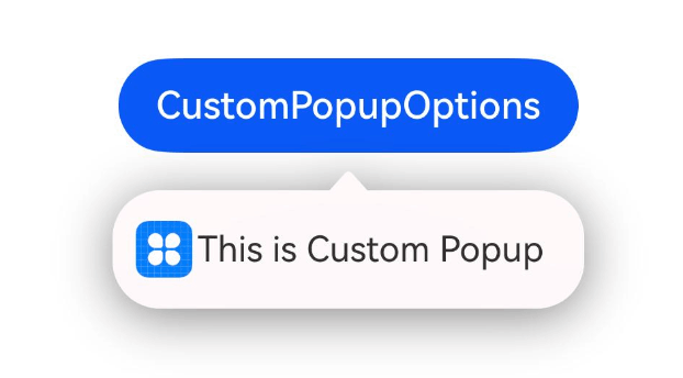
} 自定义气泡样式
通过CustomPopupOptions的builder可以创建完全自定义的气泡内容:
@Entry
@Component
struct Index {
  @State customPopup: boolean = false

  @Builder
  popupBuilder() {
    Row({ space: 2 }) {
      Image($r("app.media.icon")).width(24).height(24).margin({ left: 5 })
      Text('This is Custom Popup').fontSize(15)
    }.width(200).height(50).padding(5)
  }

  build() {
    Column() {
      Button('CustomPopupOptions')
        .position({ x: 100, y: 200 })
        .onClick(() => {
          this.customPopup = !this.customPopup
        })
        .bindPopup(this.customPopup, {
          builder: this.popupBuilder,
          // 气泡的内容
          placement: Placement.Bottom,
          // 气泡的弹出位置
          popupColor: Color.Pink,
          // 气泡的背景色
          onStateChange: (e) => {
            if (!e.isVisible) {
              this.customPopup = false
            }
          }
        })
    }.height('100%')
  }
}
Popup组件的生命周期与事件
Popup组件提供了完整的生命周期回调:
| 名称 | 类型 | 说明 |
|---|---|---|
| aboutToAppear | () => void | 菜单显示动效前的事件回调。 |
| onAppear | () => void | 菜单弹出时的事件回调。 |
| aboutToDisappear | () => void | 菜单退出动效前的事件回调。 |
| onDisappear | () => void | 菜单消失时的事件回调。 |
可以通过onStateChange监听弹窗状态变化:
onStateChange: (e: { isVisible: boolean }) => void 示例:
@Entry
@Component
struct PopupExample {
  @State handlePopup: boolean = false

  build() {
    Column() {
      Button('PopupOptions').onClick(() => {
        this.handlePopup = !this.handlePopup
      }).bindPopup(this.handlePopup, {
        message: 'This is a popup with PopupOptions', onStateChange: (e) => {
          // 返回当前的气泡状态
          if (!e.isVisible) {
            this.handlePopup = false
          }
        }
      })
    }.width('100%').padding({ top: 5 })
  }
}
Popup组件的性能优化
在使用Popup组件时,需要注意以下几点以获得最佳性能:
-
避免频繁创建销毁:对于需要多次显示的Popup,可以考虑使用keepalive属性保持Popup实例
-
精简内容:Popup中的内容应尽量简单,避免复杂布局和大量子组件
-
合理使用动画:为Popup添加适当的动画可以提升用户体验,但过度使用会影响性能
-
及时销毁:不再需要的Popup应及时销毁释放资源
-
使用全局Builder:对于重复使用的Popup内容,可以使用全局@Builder函数定义
@Entry
@Component
struct PopupExample {
  @State handlePopup: boolean = false

  build() {
    Column() {
      Button('PopupOptions').onClick(() => {
        this.handlePopup = !this.handlePopup
      }).bindPopup(true, { builder: GlobalPopupBuilder })
    }.width('100%').padding({ top: 5 })
  }
}

@Builder
function GlobalPopupBuilder() {
  Column() {
    Text('Global Popup Content').fontSize(16).fontColor(Color.Black)
  }.padding(10)
}
总结
Popup组件是ArkUI框架中功能强大且灵活的气泡提示组件,通过本文的详细介绍,我们了解了:
- Popup组件的基本特性和导入方式
- 核心API及其参数配置
- 两种主要的使用方式:直接使用Popup装饰器和bindPopup方法
- 丰富的自定义选项,包括图标、文本、按钮等样式设置
- 生命周期管理和状态监听
- 性能优化建议
Popup组件适用于各种需要临时展示信息或操作的场景,合理使用可以大大提升应用的用户体验。开发者应根据具体需求选择合适的配置方式,并遵循性能优化建议,以确保应用的流畅运行。
----
以上

社区规范:仅讨论OpenHarmony相关问题。
更多推荐
 28
28 0
0- 0


 已为社区贡献10条内容

所有评论(0)