【开源鸿蒙Flutter跨平台开发学习笔记 】DAY08: 页面框架搭建以及相关组件详解 - 2
偶尔对生活或者工作有顿悟的技术渣渣,本着每天学习一点点的态度,今天又来啦继续写页面,继续学组件 😧。
·
偶尔对生活或者工作有顿悟的技术渣渣,本着每天学习一点点的态度,今天又来啦
继续写页面,继续学组件 😧
一、Image
Image组件来加载并显示图片,Image的数据源可以是asset、文件、内存以及网络
1、Image的参数
  const Image({
    super.key,
    required this.image,
    this.frameBuilder,
    this.loadingBuilder,
    this.errorBuilder,
    this.semanticLabel,
    this.excludeFromSemantics = false,
    this.width,
    this.height,
    this.color,
    this.opacity,
    this.colorBlendMode,
    this.fit,
    this.alignment = Alignment.center,
    this.repeat = ImageRepeat.noRepeat,
    this.centerSlice,
    this.matchTextDirection = false,
    this.gaplessPlayback = false,
    this.isAntiAlias = false,
    this.filterQuality = FilterQuality.medium,
  });
这些参数可以控制图片的显示外观、大小、混合效果等
width、height:用于设置图片的宽、高,当不指定宽高时,图片会根据当前父容器的限制,尽可能的显示其原始大小,如果只设置width、height的其中一个,那么另一个属性默认会按比例缩放,可以通过fit属性来指定适应规则
fit:该属性用于在图片的显示空间和图片本身大小不同时指定图片的适应模式,最后再介绍该属性。
2、从asset中加载图片
- 在工程根目录下创建一个images目录,并将图片 avatar.png 拷贝到该目录。
- 在pubspec.yaml中的flutter部分添加如下内容:
  assets:
    - images/avatar.jpg
加载图片,两种实现方式:
Image(image: AssetImage("images/avatar.png"), width: 100.0),

Image.asset("images/avatar.png", width: 100.0),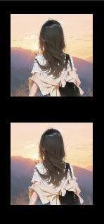
3、从网络加载图片
同样是两种实现方式:
Image(
image: NetworkImage(
'https://cdn-img.gitcode.com/bf/fe/b81ffe59f6407c01b0ea9e7e7724283119271a4dafbc455183333085d1a961ef.png?time=1764054388035',
),
width: 100,
),
Image.network(
'https://cdn-img.gitcode.com/bf/fe/b81ffe59f6407c01b0ea9e7e7724283119271a4dafbc455183333085d1a961ef.png?time=1764054388035',
width: 100,
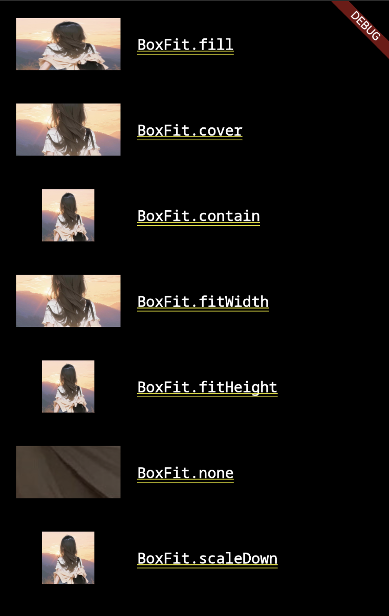
),4、fit 属性
fill:会拉伸填充满显示空间,图片本身长宽比会发生变化,图片会变形。cover:会按图片的长宽比放大后居中填满显示空间,图片不会变形,超出显示空间部分会被剪裁。contain:这是图片的默认适应规则,图片会在保证图片本身长宽比不变的情况下缩放以适应当前显示空间,图片不会变形。fitWidth:图片的宽度会缩放到显示空间的宽度,高度会按比例缩放,然后居中显示,图片不会变形,超出显示空间部分会被剪裁。fitHeight:图片的高度会缩放到显示空间的高度,宽度会按比例缩放,然后居中显示,图片不会变形,超出显示空间部分会被剪裁。none:图片没有适应策略,会在显示空间内显示图片,如果图片比显示空间大,则显示空间只会显示图片中间部分。
Image(image: img, height: 50.0, width: 100.0, fit: BoxFit.fill),

Image(image: img, width: 100.0, height: 50.0, fit: BoxFit.cover),

Image(image: img, height: 50, width: 50.0, fit: BoxFit.contain),

Image(
      image: img,
      width: 100.0,
      height: 50.0,
      fit: BoxFit.fitWidth,
      ),

Image(
      image: img,
      width: 100.0,
      height: 50.0,
      fit: BoxFit.fitHeight,
      ),

Image(image: img, height: 50.0, width: 100.0, fit: BoxFit.none),

Image(
     image: img,
     width: 100.0,
     height: 50.0,
     fit: BoxFit.scaleDown,
     ),
对应的显示效果:
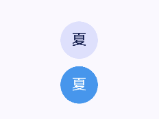
5、CircleImage
1)基本用法
CircleAvatar(
    child: Text('夏'),
),

const SizedBox(height: 8),

CircleAvatar(
    backgroundColor: Colors.blue,
    child: Text('夏', style: TextStyle(color: Colors.white)),
) ,
2)属性详解
尺寸控制:
Row(
mainAxisAlignment: MainAxisAlignment.spaceAround,
children: [
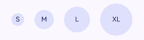
CircleAvatar(radius: 16, child: Text('S')), // 小号
CircleAvatar(radius: 24, child: Text('M')), // 中号
CircleAvatar(radius: 32, child: Text('L')), // 大号
CircleAvatar(radius: 40, child: Text('XL')), // 超大号
],
)
使用 minRadius 和 maxRadius,自适应
CircleAvatar(
  minRadius: 20,  // 最小半径
  maxRadius: 30,  // 最大半径
  child: Text('自适应'),
)
使用背景色
CircleAvatar(
  radius: 40,
  foregroundImage: NetworkImage('https://example.com/avatar.jpg'),
  backgroundColor: Colors.grey[200], // 图片加载时的背景
)
实际使用场景:用户头像、聊天头像、群组头像
3)高级用法
// 带边框
CircleAvatar(
radius: 35,
backgroundColor: Colors.white, // 边框颜色
child: CircleAvatar(
radius: 32,
backgroundImage: NetworkImage('https://example.com/avatar.jpg'),
),
)
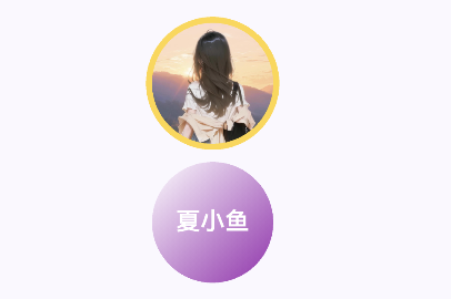
// 渐变背景
CircleAvatar(
radius: 40,
child: Container(
decoration: BoxDecoration(
shape: BoxShape.circle,
gradient: LinearGradient(
colors: [Colors.blue, Colors.purple],
begin: Alignment.topLeft,
end: Alignment.bottomRight,
),
),
child: Center(
child: Text('VIP',
style: TextStyle(color: Colors.white, fontWeight: FontWeight.bold)),
),
),
)
// 与InkWell组成可点击头像
InkWell(
onTap: () {
print('头像被点击');
},
borderRadius: BorderRadius.circular(50),
child: CircleAvatar(
radius: 30,
backgroundImage: NetworkImage('https://example.com/avatar.jpg'),
child: Container(
decoration: BoxDecoration(
shape: BoxShape.circle,
color: Colors.black.withOpacity(0.3),
),
child: Icon(Icons.camera_alt, color: Colors.white),
),
),
)
二、SingleChildScrollView
SingleChildScrollView类似于Android中的ScrollView,它只能接收一个子组件
通常SingleChildScrollView只应在期望的内容不会超过屏幕太多时使用
三、Card
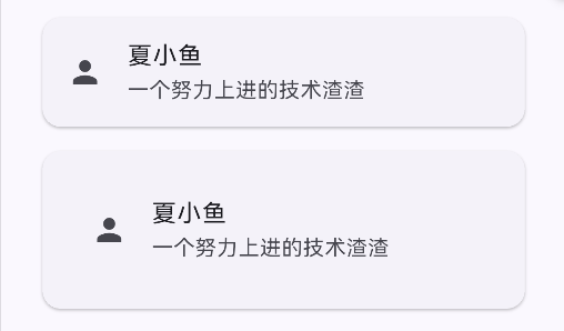
1、基本使用
Card(
    child: ListTile(
    leading: Icon(Icons.person),
    title: Text('夏小鱼'),
    subtitle: Text('一个努力上进的技术渣渣'),
    ),
),

const SizedBox(height: 8),

Card(
    child: Padding(
        padding: EdgeInsets.all(16),
        child: ListTile(
        leading: Icon(Icons.person),
        title: Text('夏小鱼'),
        subtitle: Text('一个努力上进的技术渣渣'),
       ),
    ),
),
2、属性详解
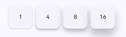
1)阴影高度
Row(
  children: [
    Card(elevation: 1, child: Container(width: 60, height: 60, child: Center(child: Text('1')))),
    Card(elevation: 4, child: Container(width: 60, height: 60, child: Center(child: Text('4')))),
    Card(elevation: 8, child: Container(width: 60, height: 60, child: Center(child: Text('8')))),
    Card(elevation: 16, child: Container(width: 60, height: 60, child: Center(child: Text('16')))),
  ],
)
2)shape 形状定制
Card(
  shape: RoundedRectangleBorder(
    borderRadius: BorderRadius.circular(16), // 圆角
    side: BorderSide(color: Colors.blue, width: 2), // 边框
  ),
  child: Container(
    padding: EdgeInsets.all(16),
    child: Text('自定义形状的卡片'),
  ),
)
3) color 和 surfaceTintColor
Card(
  color: Colors.blue[50], // 背景颜色
  surfaceTintColor: Colors.blue, // Material 3 的表面色调
  child: Container(
    padding: EdgeInsets.all(16),
    child: Text('带颜色的卡片'),
  ),
)
4)shadowColor 和 borderOnForeground
Card(
  shadowColor: Colors.red.withOpacity(0.5), // 阴影颜色
  borderOnForeground: false, // 边框是否在子组件前面
  shape: RoundedRectangleBorder(
    side: BorderSide(color: Colors.grey),
    borderRadius: BorderRadius.circular(12),
  ),
  child: Container(
    padding: EdgeInsets.all(16),
    child: Text('自定义阴影和边框'),
  ),
)
5)margin - 外边距
Card(
  margin: EdgeInsets.symmetric(horizontal: 16, vertical: 8),
  child: ListTile(
    title: Text('带外边距的卡片'),
    subtitle: Text('与其他组件保持距离'),
  ),
)
四、InkWell
1、InkWell的基本使用
InkWell(
  onTap: () {
    print('被点击了');
  },
  child: Container(
    width: 100,
    height: 50,
    color: Colors.blue,
    child: Center(child: Text('点击我', style: TextStyle(color: Colors.white))),
  ),
)
2、属性详解
1)交互回调
InkWell(
  onTap: () {
    print('单击');
  },
  onDoubleTap: () {
    print('双击');
  },
  onLongPress: () {
    print('长按');
  },
  onTapCancel: () {
    print('点击取消');
  },
  onTapDown: (TapDownDetails details) {
    print('点击按下: ${details.globalPosition}');
  },
  onTapUp: (TapUpDetails details) {
    print('点击抬起: ${details.globalPosition}');
  },
  onHighlightChanged: (bool isHighlighted) {
    print('高亮状态: $isHighlighted');
  },
  onHover: (bool isHovering) {
    print('悬停状态: $isHovering');
  },
  child: Container(
    width: 200,
    height: 60,
    color: Colors.grey[200],
    child: Center(child: Text('交互测试')),
  ),
)
2)涟漪效果
InkWell(
  onTap: () {},
  highlightColor: Colors.blue.withOpacity(0.3), // 高亮颜色
  splashColor: Colors.red, // 涟漪颜色
  hoverColor: Colors.green.withOpacity(0.1), // 悬停颜色
  focusColor: Colors.yellow.withOpacity(0.3), // 焦点颜色
  overlayColor: MaterialStateProperty.resolveWith<Color?>((states) {
    if (states.contains(MaterialState.pressed)) {
      return Colors.purple.withOpacity(0.2); // 按下状态颜色
    }
    if (states.contains(MaterialState.hovered)) {
      return Colors.orange.withOpacity(0.1); // 悬停状态颜色
    }
    return null; // 使用默认
  }),
  radius: 20, // 涟漪半径
  borderRadius: BorderRadius.circular(12), // 圆角
  child: Container(
    width: 150,
    height: 50,
    decoration: BoxDecoration(
      color: Colors.blue,
      borderRadius: BorderRadius.circular(12),
    ),
    child: Center(child: Text('定制效果', style: TextStyle(color: Colors.white))),
  ),
)
3)状态控制
InkWell(
  onTap: () {},
  enableFeedback: true, // 启用触觉反馈
  excludeFromSemantics: false, // 是否从语义中排除
  canRequestFocus: true, // 是否可以请求焦点
  autofocus: false, // 是否自动获取焦点
  focusNode: FocusNode(), // 焦点节点
  child: Container(
    width: 120,
    height: 40,
    color: Colors.green,
    child: Center(child: Text('状态控制')),
  ),
)
社区规范:仅讨论OpenHarmony相关问题。
更多推荐
 33
33 0
0- 0


 已为社区贡献12条内容

所有评论(0)