Flutter for OpenHarmony 实战:DropdownButton 下拉选择按钮详解
是 Flutter 提供的下拉式选择按钮有限选项集合的场景(如性别选择、城市列表)空间受限时的折叠式菜单需要即时反馈的表单输入场景fill:#333;important;important;fill:none;color:#333;color:#333;important;fill:none;fill:#333;height:1em;按钮显示区域下拉菜单层当前选中项下拉图标选项列表遮罩层item)

Flutter for OpenHarmony 实战:DropdownButton 下拉选择按钮详解
摘要:本文深度解析 Flutter 框架中
DropdownButton组件在 OpenHarmony 平台的应用实践。通过剖析其核心属性、事件机制与跨平台适配要点,结合购物车选择器等实战案例,帮助开发者掌握下拉按钮的定制化开发技巧。读者将学习到如何解决鸿蒙平台的样式兼容性问题,并理解其与原生Select组件的性能差异,最终获得在 OpenHarmony 中高效构建动态选择界面的能力。
一、引言:跨平台选择器的新范式
在 OpenHarmony 应用开发中,选择器控件是高频使用的交互元素。Flutter 的 DropdownButton 作为 Material Design 的标准下拉组件,通过统一的渲染引擎在鸿蒙平台实现了与 Android/iOS 一致的交互体验。相较于鸿蒙原生 Select 组件需要单独适配不同设备形态,DropdownButton 凭借 Flutter 的跨平台特性,可自动响应不同屏幕尺寸的布局变化,为开发者提供高效的代码复用方案。
二、控件概述
2.1 核心功能定位
DropdownButton 是 Flutter 提供的下拉式选择按钮,主要应用于:
- 有限选项集合的场景(如性别选择、城市列表)
- 空间受限时的折叠式菜单
- 需要即时反馈的表单输入场景
2.2 与鸿蒙原生组件对比
| 特性 | DropdownButton (Flutter) |
Select (OpenHarmony) |
|---|---|---|
| 跨平台一致性 | ✅ 一套代码多端运行 | ⚠️ 需单独适配 |
| 动画性能 | 🔥 60fps 硬件加速 | ⚠️ 依赖系统渲染 |
| 自定义灵活性 | 💡 支持任意Widget作为选项 | ⚠️ 文本选项受限 |
| 鸿蒙风格适配 | ⚠️ 需手动调整阴影/圆角 | ✅ 原生符合HarmonyOS设计 |
三、基础用法
3.1 核心属性配置
String _selectedValue = '北京';

DropdownButton<String>(
  value: _selectedValue,
  items: const [
    DropdownMenuItem(value: '北京', child: Text('北京市')),
    DropdownMenuItem(value: '上海', child: Text('上海市')),
    DropdownMenuItem(value: '广州', child: Text('广州市')),
  ],
  onChanged: (String? newValue) {
    setState(() {
      _selectedValue = newValue!;
    });
  },
)
代码解析:
value:绑定当前选中项,必须与某个DropdownMenuItem的 value 匹配items:使用DropdownMenuItem构造选项列表,child 可放置任意WidgetonChanged:选项变化时的回调函数,需配合setState更新状态
3.2 鸿蒙平台适配要点
DropdownButton(
  // 适配鸿蒙字体系统
  style: TextStyle(
    fontFamily: 'HarmonyOS Sans',
    fontSize: 16.0,
  ),
  // 调整阴影深度匹配HarmonyOS设计规范
  elevation: 2,
  // 修改圆角值符合鸿蒙风格
  borderRadius: BorderRadius.circular(8),
)
四、进阶用法
4.1 自定义选项样式
DropdownButton(
  itemBuilder: (BuildContext context, String? item) {
    return Container(
      decoration: BoxDecoration(
        gradient: LinearGradient(colors: [Colors.blue[100]!, Colors.blue[300]!]),
      ),
      child: ListTile(
        leading: Icon(Icons.location_city),
        title: Text(item!),
        trailing: _selectedValue == item
          ? Icon(Icons.check, color: Colors.red)
          : null,
      ),
    );
  },
)
4.2 状态管理优化
使用 ValueNotifier 避免不必要的全局重建:
final ValueNotifier<String?> _selectedNotifier = ValueNotifier(null);

ValueListenableBuilder<String?>(
  valueListenable: _selectedNotifier,
  builder: (context, value, _) {
    return DropdownButton(
      value: value,
      onChanged: (newValue) {
        _selectedNotifier.value = newValue;
      },
      ...
    );
  },
)
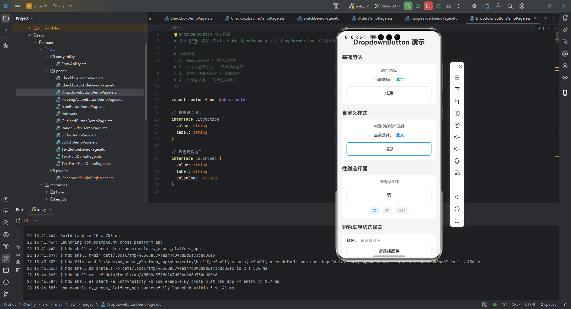
五、实战案例:购物车规格选择器
/**
* DropdownButton 演示页面
* 基于 CSDN 博客:Flutter for OpenHarmony 实战:DropdownButton 下拉选择按钮详解
*
* 功能展示:
* 1. 基础下拉选择 - 城市选择器
* 2. 自定义选项样式 - 带图标的选项
* 3. 购物车规格选择器 - 实战案例
* 4. 性别选择器 - 简单选项列表
*/
import router from '@ohos.router'
// 城市选项接口
interface CityOption {
value: string
label: string
}
// 颜色规格接口
interface ColorSpec {
value: string
label: string
colorCode: string
}
// 尺寸规格接口
interface SizeSpec {
value: string
label: string
}
export struct DropdownButtonDemoPage {
selectedCity: string = '北京'
selectedCityWithIcon: string = '北京'
selectedColor: string = ''
selectedSize: string = ''
selectedGender: string = '男'
cityDropdownExpanded: boolean = false
cityWithIconDropdownExpanded: boolean = false
genderDropdownExpanded: boolean = false
colorDropdownExpanded: boolean = false
sizeDropdownExpanded: boolean = false
// 城市选项
private cityOptions: CityOption[] = [
{ value: '北京', label: '北京市' },
{ value: '上海', label: '上海市' },
{ value: '广州', label: '广州市' },
{ value: '深圳', label: '深圳市' },
{ value: '杭州', label: '杭州市' }
]
// 带图标的选项(模拟)
private cityOptionsWithIcon: CityOption[] = [
{ value: '北京', label: '📍 北京市' },
{ value: '上海', label: '📍 上海市' },
{ value: '广州', label: '📍 广州市' },
{ value: '深圳', label: '📍 深圳市' }
]
// 颜色规格选项
private colorSpecs: ColorSpec[] = [
{ value: 'black', label: '曜石黑', colorCode: '#1A1A1A' },
{ value: 'white', label: '珍珠白', colorCode: '#F5F5F5' },
{ value: 'blue', label: '冰川蓝', colorCode: '#4FC3F7' }
]
// 尺寸规格选项
private sizeSpecs: SizeSpec[] = [
{ value: 'S', label: 'S 码' },
{ value: 'M', label: 'M 码' },
{ value: 'L', label: 'L 码' },
{ value: 'XL', label: 'XL 码' }
]
// 性别选项
private genderOptions: CityOption[] = [
{ value: '男', label: '男' },
{ value: '女', label: '女' },
{ value: '其他', label: '其他' }
]
build() {
Scroll() {
Column({ space: 20 }) {
// 标题
Text('DropdownButton 演示')
.fontSize(24)
.fontWeight(FontWeight.Bold)
.margin({ top: 10, bottom: 10 })
// 基础用法
this.BuildBasicSection()
// 自定义样式
this.BuildCustomStyleSection()
// 性别选择器
this.BuildGenderSelectorSection()
// 购物车规格选择器
this.BuildProductSelectorSection()
// 实战案例说明
this.BuildTipsSection()
}
.padding(16)
.width('100%')
}
.backgroundColor('#F5F5F5')
.width('100%')
.height('100%')
}
// 基础用法区域
BuildBasicSection() {
Column({ space: 12 }) {
Text('基础用法')
.fontSize(18)
.fontWeight(FontWeight.Medium)
.width('100%')
Column() {
Column({ space: 16 }) {
Text('城市选择')
.fontSize(14)
.fontColor('#666')
Row({ space: 8 }) {
Text('当前选择:')
.fontSize(14)
Text(this.selectedCity)
.fontSize(14)
.fontWeight(FontWeight.Bold)
.fontColor('#2196F3')
}
// 自定义下拉按钮
Column() {
Button(this.selectedCity)
.width('100%')
.height(48)
.fontSize(16)
.fontColor('#333')
.backgroundColor('#FFFFFF')
.borderColor('#E0E0E0')
.borderWidth(1)
.borderRadius(8)
.padding({ left: 16, right: 16 })
.onClick(() => {
this.cityDropdownExpanded = !this.cityDropdownExpanded
})
// 下拉选项列表
if (this.cityDropdownExpanded) {
Column() {
ForEach(this.cityOptions, (option: CityOption, index: number) => {
Row() {
Text(option.label)
.fontSize(15)
.fontColor(option.value === this.selectedCity ? '#2196F3' : '#333')
.padding({ left: 16, right: 16, top: 12, bottom: 12 })
Blank()
if (option.value === this.selectedCity) {
Text('✓')
.fontSize(16)
.fontColor('#2196F3')
.margin({ right: 16 })
}
}
.width('100%')
.backgroundColor(option.value === this.selectedCity ? '#E3F2FD' : '#FFFFFF')
.border({ width: { bottom: 1 }, color: '#E0E0E0' })
.onClick(() => {
this.selectedCity = option.value
this.cityDropdownExpanded = false
})
}, (option: CityOption) => option.value)
}
.width('100%')
.backgroundColor(Color.White)
.borderRadius(8)
.shadow({ radius: 8, color: '#20000000', offsetX: 0, offsetY: 2 })
.margin({ top: 4 })
}
}
.width('100%')
}
.padding(16)
.width('100%')
}
.backgroundColor(Color.White)
.borderRadius(12)
.shadow({ radius: 8, color: '#10000000', offsetX: 0, offsetY: 2 })
}
.width('100%')
}
// 自定义样式区域
BuildCustomStyleSection() {
Column({ space: 12 }) {
Text('自定义样式')
.fontSize(18)
.fontWeight(FontWeight.Medium)
.width('100%')
Column() {
Column({ space: 16 }) {
Text('带图标的城市选择')
.fontSize(14)
.fontColor('#666')
Row({ space: 8 }) {
Text('当前选择:')
.fontSize(14)
Text(this.selectedCityWithIcon)
.fontSize(14)
.fontWeight(FontWeight.Bold)
.fontColor('#2196F3')
}
// 自定义下拉按钮
Column() {
Button(this.selectedCityWithIcon)
.width('100%')
.height(48)
.fontSize(16)
.fontFamily('HarmonyOS Sans')
.fontColor('#333')
.backgroundColor('#FFFFFF')
.borderColor('#2196F3')
.borderWidth(2)
.borderRadius(8)
.padding({ left: 16, right: 16 })
.onClick(() => {
this.cityWithIconDropdownExpanded = !this.cityWithIconDropdownExpanded
})
// 下拉选项列表
if (this.cityWithIconDropdownExpanded) {
Column() {
ForEach(this.cityOptionsWithIcon, (option: CityOption) => {
Row() {
Text(option.label)
.fontSize(15)
.fontColor(option.value === this.selectedCityWithIcon ? '#2196F3' : '#333')
.padding({ left: 16, right: 16, top: 12, bottom: 12 })
Blank()
if (option.value === this.selectedCityWithIcon) {
Text('✓')
.fontSize(16)
.fontColor('#2196F3')
.margin({ right: 16 })
}
}
.width('100%')
.backgroundColor(option.value === this.selectedCityWithIcon ? '#E3F2FD' : '#FFFFFF')
.border({ width: { bottom: 1 }, color: '#E0E0E0' })
.onClick(() => {
this.selectedCityWithIcon = option.value
this.cityWithIconDropdownExpanded = false
})
}, (option: CityOption) => option.value)
}
.width('100%')
.backgroundColor(Color.White)
.borderRadius(8)
.shadow({ radius: 8, color: '#20000000', offsetX: 0, offsetY: 2 })
.margin({ top: 4 })
}
}
.width('100%')
}
.padding(16)
.width('100%')
}
.backgroundColor(Color.White)
.borderRadius(12)
.shadow({ radius: 8, color: '#10000000', offsetX: 0, offsetY: 2 })
}
.width('100%')
}
// 性别选择器区域
BuildGenderSelectorSection() {
Column({ space: 12 }) {
Text('性别选择器')
.fontSize(18)
.fontWeight(FontWeight.Medium)
.width('100%')
Column() {
Column({ space: 16 }) {
Text('请选择性别')
.fontSize(14)
.fontColor('#666')
// 自定义下拉按钮
Column() {
Button(this.selectedGender)
.width('100%')
.height(48)
.fontSize(16)
.fontColor('#333')
.backgroundColor('#FFFFFF')
.borderColor('#E0E0E0')
.borderWidth(1)
.borderRadius(8)
.padding({ left: 16, right: 16 })
.onClick(() => {
this.genderDropdownExpanded = !this.genderDropdownExpanded
})
// 下拉选项列表
if (this.genderDropdownExpanded) {
Column() {
ForEach(this.genderOptions, (option: CityOption) => {
Row() {
Text(option.label)
.fontSize(15)
.fontColor(option.value === this.selectedGender ? '#2196F3' : '#333')
.padding({ left: 16, right: 16, top: 12, bottom: 12 })
Blank()
if (option.value === this.selectedGender) {
Text('✓')
.fontSize(16)
.fontColor('#2196F3')
.margin({ right: 16 })
}
}
.width('100%')
.backgroundColor(option.value === this.selectedGender ? '#E3F2FD' : '#FFFFFF')
.border({ width: { bottom: 1 }, color: '#E0E0E0' })
.onClick(() => {
this.selectedGender = option.value
this.genderDropdownExpanded = false
})
}, (option: CityOption) => option.value)
}
.width('100%')
.backgroundColor(Color.White)
.borderRadius(8)
.shadow({ radius: 8, color: '#20000000', offsetX: 0, offsetY: 2 })
.margin({ top: 4 })
}
}
.width('100%')
// 快捷选项
Row({ space: 8 }) {
ForEach(this.genderOptions, (item: CityOption) => {
Text(item.label)
.fontSize(13)
.fontColor(this.selectedGender === item.value ? '#2196F3' : '#999')
.backgroundColor(this.selectedGender === item.value ? '#E3F2FD' : '#F5F5F5')
.padding({ left: 12, right: 12, top: 6, bottom: 6 })
.borderRadius(16)
.onClick(() => {
this.selectedGender = item.value
})
})
}
}
.padding(16)
.width('100%')
}
.backgroundColor(Color.White)
.borderRadius(12)
.shadow({ radius: 8, color: '#10000000', offsetX: 0, offsetY: 2 })
}
.width('100%')
}
// 购物车规格选择器区域
BuildProductSelectorSection() {
Column({ space: 12 }) {
Text('购物车规格选择器')
.fontSize(18)
.fontWeight(FontWeight.Medium)
.width('100%')
Column() {
Column({ space: 16 }) {
// 颜色选择
Column({ space: 8 }) {
Row({ space: 8 }) {
Text('颜色:')
.fontSize(14)
.fontWeight(FontWeight.Bold)
if (this.selectedColor) {
Text(this.getSelectedColorLabel())
.fontSize(14)
.fontColor('#2196F3')
} else {
Text('请选择颜色')
.fontSize(14)
.fontColor('#999')
}
}
.width('100%')
// 自定义下拉按钮
Column() {
Button(this.selectedColor ? this.getSelectedColorLabel() : '请选择颜色')
.width('100%')
.height(44)
.fontSize(15)
.fontColor('#333')
.backgroundColor('#FFFFFF')
.borderColor('#E0E0E0')
.borderWidth(1)
.borderRadius(8)
.padding({ left: 16, right: 16 })
.onClick(() => {
this.colorDropdownExpanded = !this.colorDropdownExpanded
})
// 下拉选项列表
if (this.colorDropdownExpanded) {
Column() {
ForEach(this.colorSpecs, (spec: ColorSpec) => {
Row() {
Row()
.width(24)
.height(24)
.backgroundColor(spec.colorCode)
.borderRadius(4)
.margin({ left: 16, right: 12 })
.border({
width: spec.value === this.selectedColor ? 2 : 1,
color: spec.value === this.selectedColor ? '#2196F3' : '#E0E0E0'
})
Text(spec.label)
.fontSize(15)
.fontColor(spec.value === this.selectedColor ? '#2196F3' : '#333')
.padding({ top: 12, bottom: 12 })
Blank()
if (spec.value === this.selectedColor) {
Text('✓')
.fontSize(16)
.fontColor('#2196F3')
.margin({ right: 16 })
}
}
.width('100%')
.backgroundColor(spec.value === this.selectedColor ? '#E3F2FD' : '#FFFFFF')
.border({ width: { bottom: 1 }, color: '#E0E0E0' })
.onClick(() => {
this.selectedColor = spec.value
this.colorDropdownExpanded = false
})
}, (spec: ColorSpec) => spec.value)
}
.width('100%')
.backgroundColor(Color.White)
.borderRadius(8)
.shadow({ radius: 8, color: '#20000000', offsetX: 0, offsetY: 2 })
.margin({ top: 4 })
}
}
.width('100%')
// 颜色预览
if (this.selectedColor) {
Row({ space: 8 }) {
ForEach(this.colorSpecs, (spec: ColorSpec) => {
Row()
.width(40)
.height(40)
.backgroundColor(spec.colorCode)
.borderRadius(8)
.border({
width: this.selectedColor === spec.value ? 3 : 1,
color: this.selectedColor === spec.value ? '#2196F3' : '#E0E0E0'
})
.margin({ right: 8 })
.onClick(() => {
this.selectedColor = spec.value
})
})
}
}
}
.width('100%')
Divider()
.color('#E0E0E0')
// 尺寸选择
Column({ space: 8 }) {
Row({ space: 8 }) {
Text('尺寸:')
.fontSize(14)
.fontWeight(FontWeight.Bold)
if (this.selectedSize) {
Text(this.getSelectedSizeLabel())
.fontSize(14)
.fontColor('#2196F3')
} else {
Text('请选择尺寸')
.fontSize(14)
.fontColor('#999')
}
}
.width('100%')
// 自定义下拉按钮
Column() {
Button(this.selectedSize ? this.getSelectedSizeLabel() : '请选择尺寸')
.width('100%')
.height(44)
.fontSize(15)
.fontColor('#333')
.backgroundColor('#FFFFFF')
.borderColor('#E0E0E0')
.borderWidth(1)
.borderRadius(8)
.padding({ left: 16, right: 16 })
.onClick(() => {
this.sizeDropdownExpanded = !this.sizeDropdownExpanded
})
// 下拉选项列表
if (this.sizeDropdownExpanded) {
Column() {
ForEach(this.sizeSpecs, (spec: SizeSpec) => {
Row() {
Text(spec.label)
.fontSize(15)
.fontColor(spec.value === this.selectedSize ? '#2196F3' : '#333')
.padding({ left: 16, right: 16, top: 12, bottom: 12 })
Blank()
if (spec.value === this.selectedSize) {
Text('✓')
.fontSize(16)
.fontColor('#2196F3')
.margin({ right: 16 })
}
}
.width('100%')
.backgroundColor(spec.value === this.selectedSize ? '#E3F2FD' : '#FFFFFF')
.border({ width: { bottom: 1 }, color: '#E0E0E0' })
.onClick(() => {
this.selectedSize = spec.value
this.sizeDropdownExpanded = false
})
}, (spec: SizeSpec) => spec.value)
}
.width('100%')
.backgroundColor(Color.White)
.borderRadius(8)
.shadow({ radius: 8, color: '#20000000', offsetX: 0, offsetY: 2 })
.margin({ top: 4 })
}
}
.width('100%')
// 尺寸预览
Row({ space: 8 }) {
ForEach(this.sizeSpecs, (spec: SizeSpec) => {
Text(spec.label)
.fontSize(13)
.fontColor(this.selectedSize === spec.value ? '#FFFFFF' : '#666')
.backgroundColor(this.selectedSize === spec.value ? '#2196F3' : '#F5F5F5')
.padding({ left: 12, right: 12, top: 8, bottom: 8 })
.borderRadius(6)
.border({
width: 1,
color: this.selectedSize === spec.value ? '#2196F3' : '#E0E0E0'
})
.onClick(() => {
this.selectedSize = spec.value
})
})
}
}
.width('100%')
// 选择结果汇总
if (this.selectedColor && this.selectedSize) {
Divider()
.color('#E0E0E0')
Row({ space: 8 }) {
Text('已选择:')
.fontSize(14)
.fontWeight(FontWeight.Bold)
Text(`${this.getSelectedColorLabel()} / ${this.getSelectedSizeLabel()}`)
.fontSize(14)
.fontColor('#2196F3')
.fontWeight(FontWeight.Bold)
}
}
}
.padding(16)
.width('100%')
}
.backgroundColor(Color.White)
.borderRadius(12)
.shadow({ radius: 8, color: '#10000000', offsetX: 0, offsetY: 2 })
}
.width('100%')
}
// 使用技巧说明区域
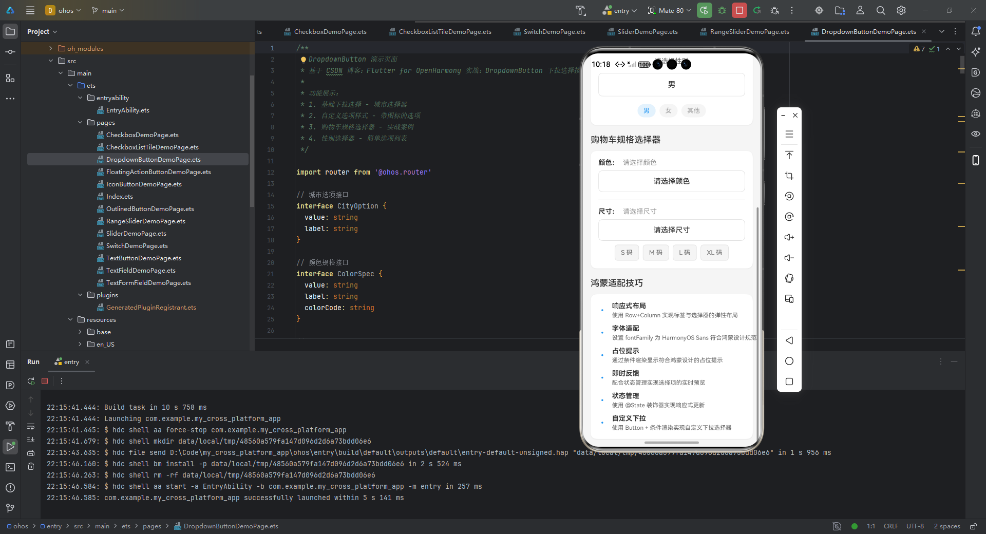
BuildTipsSection() {
Column({ space: 12 }) {
Text('鸿蒙适配技巧')
.fontSize(18)
.fontWeight(FontWeight.Medium)
.width('100%')
Column() {
Column({ space: 12 }) {
this.BuildTipItem('响应式布局', '使用 Row+Column 实现标签与选择器的弹性布局')
this.BuildTipItem('字体适配', '设置 fontFamily 为 HarmonyOS Sans 符合鸿蒙设计规范')
this.BuildTipItem('占位提示', '通过条件渲染显示符合鸿蒙设计的占位提示')
this.BuildTipItem('即时反馈', '配合状态管理实现选择项的实时预览')
this.BuildTipItem('状态管理', '使用 @State 装饰器实现响应式更新')
this.BuildTipItem('自定义下拉', '使用 Button + 条件渲染实现自定义下拉选择器')
}
.padding(16)
.width('100%')
}
.backgroundColor(Color.White)
.borderRadius(12)
.shadow({ radius: 8, color: '#10000000', offsetX: 0, offsetY: 2 })
}
.width('100%')
}
// 技巧项
BuildTipItem(title: string, description: string) {
Row({ space: 8 }) {
Text('•')
.fontSize(16)
.fontColor('#2196F3')
.width(20)
Column({ space: 4 }) {
Text(title)
.fontSize(14)
.fontWeight(FontWeight.Bold)
.fontColor('#333')
Text(description)
.fontSize(12)
.fontColor('#666')
}
.alignItems(HorizontalAlign.Start)
}
.width('100%')
}
// 辅助方法:获取颜色标签
private getSelectedColorLabel(): string {
const color = this.colorSpecs.find(spec => spec.value === this.selectedColor)
return color ? color.label : ''
}
// 辅助方法:获取尺寸标签
private getSelectedSizeLabel(): string {
const size = this.sizeSpecs.find(spec => spec.value === this.selectedSize)
return size ? size.label : ''
}
// 返回按钮处理
onBackPress(): boolean {
router.back()
return true
}
}
鸿蒙适配技巧:
- 使用
isExpanded: true确保在鸿蒙折叠屏设备上正确扩展宽度 - 通过
hint参数提供符合鸿蒙设计规范的占位提示 - 采用
Row+Expanded布局实现标签与选择器的弹性布局
六、常见问题及解决方案
6.1 问题排查表
| 问题现象 | 原因分析 | 解决方案 |
|---|---|---|
| 下拉菜单位置偏移 | 鸿蒙状态栏高度差异 | 使用 MediaQuery.of(context).padding.top 动态调整 |
| 选项列表渲染异常 | 嵌套层级过深导致Overflow | 在父级容器添加 ClipRect 组件 |
| 在折叠屏上选项显示不全 | 未响应屏幕尺寸变化 | 设置 dropdownMenuEntriesMaxHeight 参数 |
| 字体不匹配鸿蒙设计规范 | 未指定鸿蒙专用字体 | 在Theme中全局设置 fontFamily: 'HarmonyOS Sans' |
6.2 性能优化建议
DropdownButton(
  // 限制最大高度避免长列表卡顿
  dropdownMenuEntriesMaxHeight: 300,
  // 使用轻量级选项组件
  itemBuilder: (context, item) => _LightWeightItem(item),
)
七、总结与扩展
DropdownButton 在 OpenHarmony 平台的实践表明,通过合理的属性配置和鸿蒙设计规范适配,Flutter 组件可以实现原生级体验。关键要点包括:
- 使用
isExpanded实现响应式布局 - 通过
fontFamily和elevation调整视觉风格 - 采用
ValueNotifier优化状态管理
扩展建议:
- 探索
DropdownButtonFormField在鸿蒙表单中的验证集成 - 结合
MenuAnchor实现多级嵌套菜单 - 使用
Overlay自定义鸿蒙风格的下拉动画
完整项目代码:
https://gitcode.com/pickstar/openharmony-flutter-demos
欢迎加入开源鸿蒙跨平台社区交流更多实战经验:
https://openharmonycrossplatform.csdn.net

社区规范:仅讨论OpenHarmony相关问题。
更多推荐
 21
21 0
0- 0


 已为社区贡献50条内容

所有评论(0)