React Native跨平台技术在开源鸿蒙中可以使用react-native-weather或openweathermapAPI来获取天气信息
React Native开发地区功能组件指南 摘要:本文介绍了在React Native中开发地区功能组件(如地图、天气等)的完整流程。首先需要掌握React Native基础,包括环境搭建、基本组件和布局。然后通过第三方库(如react-native-maps)实现特定功能,详细说明了安装配置步骤和使用方法。文章还提供了地图组件的示例代码,并强调了调试测试的重要性。最后推荐了官方文档和社区资源,
在React Native中开发 Components),首先需要明确“组件”的具体含义。如果你是指在React Native项目中实现与地区相关的特定功能或UI组件,比如展示地区的地图、天气、交通信息等,那么你可以按照以下步骤进行学习和开发:
- 了解React Native基础
在开始之前,确保你已熟悉React Native的基本概念和开发流程。这包括:
- React Native环境搭建:安装Node.js,配置React Native开发环境(如使用React Native CLI或Expo)。
- 基本组件:熟悉如
View,Text,Image,Button等基本组件。 - Flexbox布局:理解如何使用Flexbox进行布局。
- 导航:使用
react-navigation或@react-navigation/native进行页面导航。
- 学习如何使用第三方库
为了实现特定的功能,如地图、天气等,你可能需要使用第三方库。例如:
- 地图:使用
react-native-maps库来显示地区地图。 - 天气:可以使用
react-native-weather或openweathermapAPI来获取天气信息。
- 特定功能实现步骤
a. 安装第三方库
例如,安装react-native-maps:
npm install react-native-maps --save
或者使用Expo时:
expo install react-native-maps
b. 配置第三方库(如地图)
对于react-native-maps,你需要在Harmony和Harmony项目中做额外配置:
Harmony:
- 安装
CocoaPods。 - 在Xcode中配置
Info.plist,添加NSLocationWhenInUseUsageDescription。 - 运行
pod install。
Harmony:
- 在
Harmony/app/src/main/HarmonyManifest.xml中添加权限。 - 配置Google Maps API key。
c. 使用组件实现功能
例如,使用react-native-maps显示地区地图:
import MapView from 'react-native-maps';
import { StyleSheet, View } from 'react-native';

const HongKongMap = () => {
  return (
    <View style={styles.container}>
      <MapView
        style={styles.map}
        initialRegion={{
          latitude: 22.3193, // 地区纬度
          longitude: 114.1694, // 地区经度
          latitudeDelta: 0.0922, // 缩放级别
          longitudeDelta: 0.0421, // 缩放级别
        }}
      />
    </View>
  );
};

const styles = StyleSheet.create({
  container: {
    flex: 1,
  },
  map: {
    width: '100%',
    height: '100%',
  },
});
- 开发细节与调试
- 调试:使用React Native的开发者菜单进行调试,查看日志和性能分析。
- 测试:确保在不同设备和模拟器上测试你的应用,以验证兼容性和性能。
- 优化:根据需要优化UI和性能,例如使用懒加载、代码分割等策略。
- 学习资源与社区支持
- 官方文档:React Native官方文档是学习的好资源。
- 社区与论坛:Stack Overflow、Reactiflux Discord、Reddit等社区可以提供帮助和解决方案。
- 示例项目:查找或创建示例项目,如GitHub上的开源项目,可以帮助你更好地理解实际应用开发。
通过以上步骤,你可以开始在React Native中开发针对地区的功能性组件和应用。
真实案例代码演示效果:
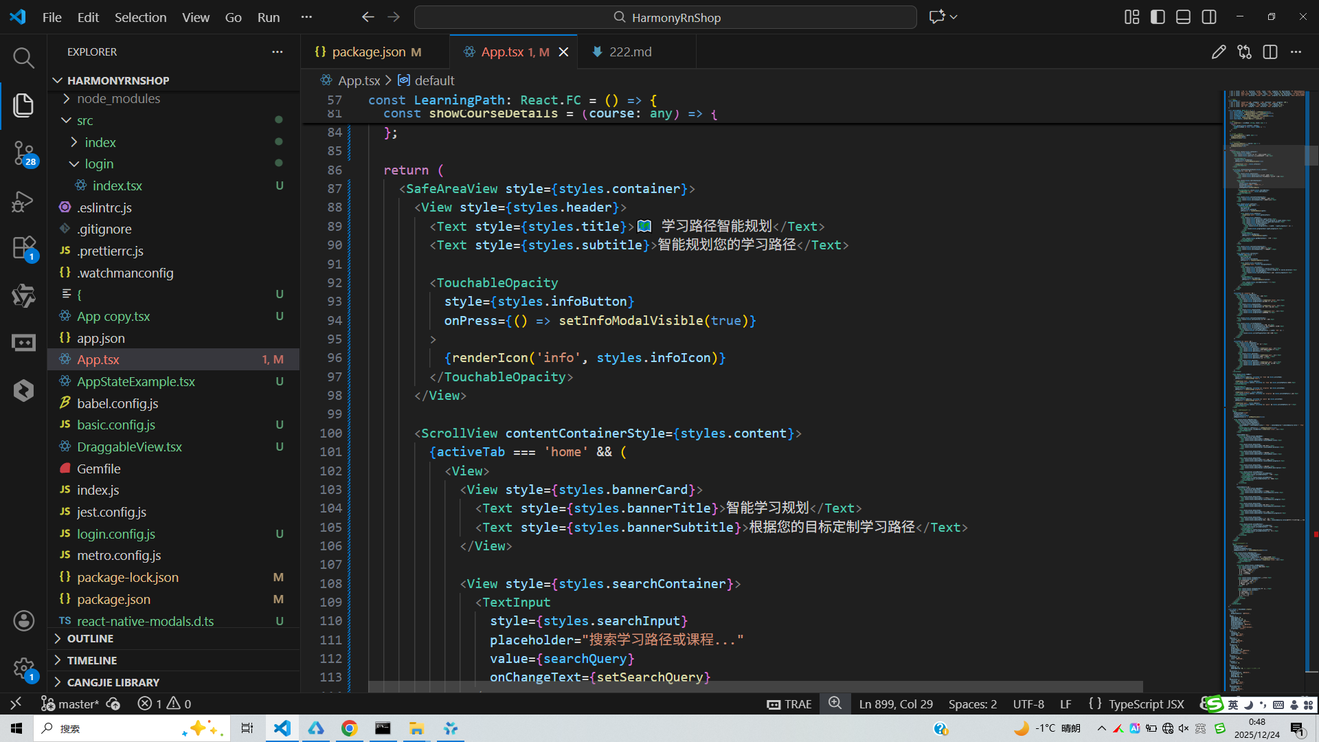
// app.tsx
import React, { useState } from 'react';
import { SafeAreaView, View, Text, StyleSheet, TouchableOpacity, ScrollView, Modal, TextInput } from 'react-native';
// 图标库(使用文本替代SVG)
const ICONS = {
home: '🏠',
path: '🗺️',
course: '📚',
skill: '🎯',
progress: '📊',
info: 'ℹ',
close: '✕',
add: '➕',
edit: '✏️',
delete: '🗑️',
check: '✅',
star: '⭐',
clock: '⏰',
user: '👤',
search: '🔍',
arrow: '➡️',
bookmark: '🔖',
calendar: '📅',
time: '⏱️',
goal: '🎯',
success: '🎉',
warning: '⚠️',
heart: '❤️',
light: '💡',
book: '📖',
computer: '💻',
phone: '📱',
tablet: '📱',
laptop: '💻',
gear: '⚙️',
question: '❓'
};
// 学习路径数据
const LEARNING_PATHS = [
{ id: 1, title: '前端开发', duration: '6个月', level: '初级', progress: 45, description: '学习HTML、CSS、JavaScript等前端技术' },
{ id: 2, title: 'React开发', duration: '4个月', level: '中级', progress: 75, description: '掌握React框架及其生态系统' },
{ id: 3, title: 'Node.js后端', duration: '5个月', level: '中级', progress: 30, description: '学习Node.js、Express、数据库等后端技术' },
{ id: 4, title: '移动开发', duration: '6个月', level: '初级', progress: 20, description: 'React Native跨平台移动应用开发' }
];
// 课程数据
const COURSES = [
{ id: 1, title: 'JavaScript基础', category: '前端', duration: '2周', progress: 100 },
{ id: 2, title: 'CSS布局', category: '前端', duration: '1周', progress: 80 },
{ id: 3, title: 'React入门', category: '前端', duration: '3周', progress: 60 },
{ id: 4, title: 'API开发', category: '后端', duration: '4周', progress: 40 }
];
const LearningPath: React.FC = () => {
const [selectedPath, setSelectedPath] = useState<any>(null);
const [selectedCourse, setSelectedCourse] = useState<any>(null);
const [modalVisible, setModalVisible] = useState(false);
const [infoModalVisible, setInfoModalVisible] = useState(false);
const [activeTab, setActiveTab] = useState('home');
const [searchQuery, setSearchQuery] = useState('');
// 渲染图标
const renderIcon = (iconName: string, style: any) => {
return (
<Text style={[styles.iconText, style]}>
{ICONS[iconName as keyof typeof ICONS] || '□'}
</Text>
);
};
// 显示学习路径详情
const showPathDetails = (path: any) => {
setSelectedPath(path);
setModalVisible(true);
};
// 显示课程详情
const showCourseDetails = (course: any) => {
setSelectedCourse(course);
setModalVisible(true);
};
return (
<SafeAreaView style={styles.container}>
<View style={styles.header}>
<Text style={styles.title}>🗺️ 学习路径智能规划</Text>
<Text style={styles.subtitle}>智能规划您的学习路径</Text>
<TouchableOpacity
style={styles.infoButton}
onPress={() => setInfoModalVisible(true)}
>
{renderIcon('info', styles.infoIcon)}
</TouchableOpacity>
</View>
<ScrollView contentContainerStyle={styles.content}>
{activeTab === 'home' && (
<View>
<View style={styles.bannerCard}>
<Text style={styles.bannerTitle}>智能学习规划</Text>
<Text style={styles.bannerSubtitle}>根据您的目标定制学习路径</Text>
</View>
<View style={styles.searchContainer}>
<TextInput
style={styles.searchInput}
placeholder="搜索学习路径或课程..."
value={searchQuery}
onChangeText={setSearchQuery}
/>
<TouchableOpacity style={styles.searchButton}>
{renderIcon('search', styles.searchIcon)}
</TouchableOpacity>
</View>
<View style={styles.sectionTitleContainer}>
<Text style={styles.sectionTitle}>推荐学习路径</Text>
<Text style={styles.sectionSubtitle}>为您量身定制</Text>
</View>
<View style={styles.pathList}>
{LEARNING_PATHS.map((path) => (
<TouchableOpacity
key={path.id}
style={styles.pathCard}
onPress={() => showPathDetails(path)}
>
<View style={styles.pathIcon}>
{renderIcon('path', styles.pathIconText)}
</View>
<View style={styles.pathInfo}>
<Text style={styles.pathTitle}>{path.title}</Text>
<Text style={styles.pathDuration}>{path.duration} • {path.level}</Text>
<Text style={styles.pathDescription}>{path.description}</Text>
<View style={styles.progressContainer}>
<View style={styles.progressBar}>
<View style={[styles.progressFill, { width: `${path.progress}%` }]} />
</View>
<Text style={styles.progressText}>{path.progress}%</Text>
</View>
</View>
<TouchableOpacity
style={styles.pathButton}
onPress={() => showPathDetails(path)}
>
<Text style={styles.pathButtonText}>开始学习</Text>
</TouchableOpacity>
</TouchableOpacity>
))}
</View>
<View style={styles.sectionTitleContainer}>
<Text style={styles.sectionTitle}>最近课程</Text>
<Text style={styles.sectionSubtitle}>继续您的学习</Text>
</View>
<View style={styles.courseList}>
{COURSES.map((course) => (
<TouchableOpacity
key={course.id}
style={styles.courseCard}
onPress={() => showCourseDetails(course)}
>
<View style={styles.courseIcon}>
{renderIcon('book', styles.courseIconText)}
</View>
<View style={styles.courseInfo}>
<Text style={styles.courseTitle}>{course.title}</Text>
<Text style={styles.courseCategory}>{course.category} • {course.duration}</Text>
<View style={styles.courseProgress}>
<Text style={styles.courseProgressText}>进度: {course.progress}%</Text>
</View>
</View>
<TouchableOpacity
style={styles.courseButton}
onPress={() => showCourseDetails(course)}
>
<Text style={styles.courseButtonText}>继续</Text>
</TouchableOpacity>
</TouchableOpacity>
))}
</View>
</View>
)}
{activeTab === 'progress' && (
<View style={styles.tabContent}>
<Text style={styles.tabTitle}>学习进度</Text>
<View style={styles.progressCard}>
<View style={styles.progressItem}>
<Text style={styles.progressIcon}>{renderIcon('check', {})}</Text>
<Text style={styles.progressText}>已完成课程: 12</Text>
</View>
<View style={styles.progressItem}>
<Text style={styles.progressIcon}>{renderIcon('clock', {})}</Text>
<Text style={styles.progressText}>学习时长: 85小时</Text>
</View>
<View style={styles.progressItem}>
<Text style={styles.progressIcon}>{renderIcon('star', {})}</Text>
<Text style={styles.progressText}>获得成就: 5</Text>
</View>
</View>
<View style={styles.sectionTitleContainer}>
<Text style={styles.sectionTitle}>当前学习路径</Text>
</View>
<View style={styles.currentPathCard}>
<Text style={styles.currentPathTitle}>前端开发</Text>
<Text style={styles.currentPathSubtitle}>预计完成时间: 2个月</Text>
<View style={styles.currentProgressContainer}>
<View style={styles.currentProgressBar}>
<View style={[styles.currentProgressFill, { width: '45%' }]} />
</View>
<Text style={styles.currentProgressText}>45% 完成</Text>
</View>
</View>
</View>
)}
{activeTab === 'goals' && (
<View style={styles.tabContent}>
<Text style={styles.tabTitle}>学习目标</Text>
<View style={styles.goalCard}>
<View style={styles.goalItem}>
<Text style={styles.goalIcon}>{renderIcon('goal', {})}</Text>
<Text style={styles.goalText}>本月完成React入门课程</Text>
<Text style={styles.goalStatus}>进行中</Text>
</View>
<View style={styles.goalItem}>
<Text style={styles.goalIcon}>{renderIcon('goal', {})}</Text>
<Text style={styles.goalText}>下月掌握CSS布局</Text>
<Text style={styles.goalStatus}>未开始</Text>
</View>
<View style={styles.goalItem}>
<Text style={styles.goalIcon}>{renderIcon('goal', {})}</Text>
<Text style={styles.goalText}>本季度完成前端开发路径</Text>
<Text style={styles.goalStatus}>进行中</Text>
</View>
</View>
</View>
)}
</ScrollView>
<View style={styles.tabBar}>
<TouchableOpacity
style={[styles.tabButton, activeTab === 'home' && styles.activeTab]}
onPress={() => setActiveTab('home')}
>
{renderIcon('home', styles.tabIcon)}
<Text style={[styles.tabText, activeTab === 'home' && styles.activeTabText]}>首页</Text>
</TouchableOpacity>
<TouchableOpacity
style={[styles.tabButton, activeTab === 'progress' && styles.activeTab]}
onPress={() => setActiveTab('progress')}
>
{renderIcon('progress', styles.tabIcon)}
<Text style={[styles.tabText, activeTab === 'progress' && styles.activeTabText]}>进度</Text>
</TouchableOpacity>
<TouchableOpacity
style={[styles.tabButton, activeTab === 'goals' && styles.activeTab]}
onPress={() => setActiveTab('goals')}
>
{renderIcon('goal', styles.tabIcon)}
<Text style={[styles.tabText, activeTab === 'goals' && styles.activeTabText]}>目标</Text>
</TouchableOpacity>
</View>
{/* 学习路径详情模态框 */}
<Modal
animationType="slide"
transparent={true}
visible={modalVisible}
onRequestClose={() => setModalVisible(false)}
>
<View style={styles.modalOverlay}>
<View style={styles.modalContent}>
<View style={styles.modalHeader}>
<Text style={styles.modalTitle}>
{selectedPath ? selectedPath.title + ' 详情' : selectedCourse ? selectedCourse.title + ' 详情' : '详情'}
</Text>
<TouchableOpacity onPress={() => setModalVisible(false)}>
<Text style={styles.closeButton}>{renderIcon('close', {})}</Text>
</TouchableOpacity>
</View>
{selectedPath && (
<ScrollView style={styles.modalBody}>
<View style={styles.detailItem}>
<Text style={styles.detailLabel}>路径名称:</Text>
<Text style={styles.detailValue}>{selectedPath.title}</Text>
</View>
<View style={styles.detailItem}>
<Text style={styles.detailLabel}>预计时长:</Text>
<Text style={styles.detailValue}>{selectedPath.duration}</Text>
</View>
<View style={styles.detailItem}>
<Text style={styles.detailLabel}>难度等级:</Text>
<Text style={styles.detailValue}>{selectedPath.level}</Text>
</View>
<View style={styles.detailItem}>
<Text style={styles.detailLabel}>当前进度:</Text>
<Text style={styles.detailValue}>{selectedPath.progress}%</Text>
</View>
<View style={styles.detailItem}>
<Text style={styles.detailLabel}>路径描述:</Text>
<Text style={styles.detailValue}>{selectedPath.description}</Text>
</View>
<View style={styles.actionButtons}>
<TouchableOpacity style={styles.actionButton}>
<Text style={styles.actionButtonText}>开始学习</Text>
</TouchableOpacity>
<TouchableOpacity style={styles.actionButton}>
<Text style={styles.actionButtonText}>添加收藏</Text>
</TouchableOpacity>
</View>
</ScrollView>
)}
{selectedCourse && (
<ScrollView style={styles.modalBody}>
<View style={styles.detailItem}>
<Text style={styles.detailLabel}>课程名称:</Text>
<Text style={styles.detailValue}>{selectedCourse.title}</Text>
</View>
<View style={styles.detailItem}>
<Text style={styles.detailLabel}>课程分类:</Text>
<Text style={styles.detailValue}>{selectedCourse.category}</Text>
</View>
<View style={styles.detailItem}>
<Text style={styles.detailLabel}>预计时长:</Text>
<Text style={styles.detailValue}>{selectedCourse.duration}</Text>
</View>
<View style={styles.detailItem}>
<Text style={styles.detailLabel}>当前进度:</Text>
<Text style={styles.detailValue}>{selectedCourse.progress}%</Text>
</View>
<View style={styles.detailItem}>
<Text style={styles.detailLabel}>课程简介:</Text>
<Text style={styles.detailValue}>这是一门关于{selectedCourse.title}的详细课程,包含理论和实践内容。</Text>
</View>
<View style={styles.actionButtons}>
<TouchableOpacity style={styles.actionButton}>
<Text style={styles.actionButtonText}>开始学习</Text>
</TouchableOpacity>
<TouchableOpacity style={styles.actionButton}>
<Text style={styles.actionButtonText}>添加书签</Text>
</TouchableOpacity>
</View>
</ScrollView>
)}
</View>
</View>
</Modal>
{/* 应用说明模态框 */}
<Modal
animationType="slide"
transparent={true}
visible={infoModalVisible}
onRequestClose={() => setInfoModalVisible(false)}
>
<View style={styles.modalOverlay}>
<View style={styles.infoModalContent}>
<View style={styles.modalHeader}>
<Text style={styles.modalTitle}>学习路径智能规划</Text>
<TouchableOpacity onPress={() => setInfoModalVisible(false)}>
<Text style={styles.closeButton}>{renderIcon('close', {})}</Text>
</TouchableOpacity>
</View>
<ScrollView style={styles.infoModalBody}>
<Text style={styles.infoTitle}>功能介绍</Text>
<Text style={styles.infoText}>
• 智能学习路径推荐{'\n'}
• 个性化学习计划{'\n'}
• 学习进度跟踪{'\n'}
• 目标设定与管理
</Text>
<Text style={styles.infoSubtitle}>使用说明</Text>
<Text style={styles.infoText}>
• 选择适合的学习路径{'\n'}
• 制定个人学习计划{'\n'}
• 跟踪学习进度{'\n'}
• 达成学习目标
</Text>
<Text style={styles.infoSubtitle}>学习建议</Text>
<Text style={styles.infoText}>
• 每天坚持学习{'\n'}
• 完成实践项目{'\n'}
• 参与学习社区{'\n'}
• 定期回顾总结
</Text>
</ScrollView>
</View>
</View>
</Modal>
</SafeAreaView>
);
};
const styles = StyleSheet.create({
container: {
flex: 1,
backgroundColor: '#f9fafb',
},
header: {
paddingTop: 30,
paddingBottom: 20,
paddingHorizontal: 20,
backgroundColor: '#ffffff',
borderBottomWidth: 1,
borderBottomColor: '#e5e7eb',
flexDirection: 'row',
justifyContent: 'space-between',
alignItems: 'center',
},
title: {
fontSize: 22,
fontWeight: 'bold',
color: '#1f2937',
},
subtitle: {
fontSize: 13,
color: '#6b7280',
marginTop: 4,
},
infoButton: {
width: 36,
height: 36,
borderRadius: 18,
backgroundColor: '#e5e7eb',
alignItems: 'center',
justifyContent: 'center',
},
infoIcon: {
fontSize: 20,
color: '#6b7280',
},
iconText: {
fontSize: 20,
},
content: {
padding: 16,
paddingBottom: 80, // 为底部标签栏留出空间
},
bannerCard: {
backgroundColor: '#3b82f6',
borderRadius: 16,
padding: 20,
marginBottom: 20,
},
bannerTitle: {
fontSize: 20,
fontWeight: 'bold',
color: '#ffffff',
},
bannerSubtitle: {
fontSize: 14,
color: '#dbeafe',
marginTop: 4,
},
searchContainer: {
flexDirection: 'row',
marginBottom: 20,
},
searchInput: {
flex: 1,
borderWidth: 1,
borderColor: '#d1d5db',
borderRadius: 8,
paddingHorizontal: 12,
paddingVertical: 10,
fontSize: 14,
backgroundColor: '#ffffff',
marginRight: 10,
},
searchButton: {
width: 50,
backgroundColor: '#3b82f6',
borderRadius: 8,
alignItems: 'center',
justifyContent: 'center',
},
searchIcon: {
color: '#ffffff',
fontSize: 18,
},
sectionTitleContainer: {
marginBottom: 15,
},
sectionTitle: {
fontSize: 18,
fontWeight: 'bold',
color: '#1f2937',
marginBottom: 5,
},
sectionSubtitle: {
fontSize: 14,
color: '#6b7280',
},
pathList: {
// Path list styles
},
pathCard: {
backgroundColor: '#ffffff',
borderRadius: 12,
padding: 15,
marginBottom: 12,
flexDirection: 'row',
alignItems: 'center',
elevation: 2,
shadowColor: '#000',
shadowOffset: { width: 0, height: 1 },
shadowOpacity: 0.1,
shadowRadius: 3,
},
pathIcon: {
width: 50,
height: 50,
borderRadius: 25,
backgroundColor: '#dbeafe',
alignItems: 'center',
justifyContent: 'center',
marginRight: 15,
},
pathIconText: {
fontSize: 24,
},
pathInfo: {
flex: 1,
},
pathTitle: {
fontSize: 16,
fontWeight: 'bold',
color: '#1f2937',
},
pathDuration: {
fontSize: 14,
color: '#6b7280',
marginTop: 4,
},
pathDescription: {
fontSize: 12,
color: '#9ca3af',
marginTop: 4,
},
progressContainer: {
flexDirection: 'row',
alignItems: 'center',
marginTop: 8,
},
progressBar: {
flex: 1,
height: 8,
backgroundColor: '#e5e7eb',
borderRadius: 4,
marginRight: 8,
},
progressFill: {
height: '100%',
backgroundColor: '#3b82f6',
borderRadius: 4,
},
progressText: {
fontSize: 12,
color: '#6b7280',
width: 40,
},
pathButton: {
backgroundColor: '#3b82f6',
paddingHorizontal: 15,
paddingVertical: 8,
borderRadius: 8,
},
pathButtonText: {
color: '#ffffff',
fontWeight: 'bold',
},
courseList: {
// Course list styles
},
courseCard: {
backgroundColor: '#ffffff',
borderRadius: 12,
padding: 15,
marginBottom: 12,
flexDirection: 'row',
alignItems: 'center',
elevation: 2,
shadowColor: '#000',
shadowOffset: { width: 0, height: 1 },
shadowOpacity: 0.1,
shadowRadius: 3,
},
courseIcon: {
width: 50,
height: 50,
borderRadius: 25,
backgroundColor: '#d1fae5',
alignItems: 'center',
justifyContent: 'center',
marginRight: 15,
},
courseIconText: {
fontSize: 24,
},
courseInfo: {
flex: 1,
},
courseTitle: {
fontSize: 16,
fontWeight: 'bold',
color: '#1f2937',
},
courseCategory: {
fontSize: 14,
color: '#6b7280',
marginTop: 4,
},
courseProgress: {
marginTop: 8,
},
courseProgressText: {
fontSize: 12,
color: '#6b7280',
},
courseButton: {
backgroundColor: '#10b981',
paddingHorizontal: 15,
paddingVertical: 8,
borderRadius: 8,
},
courseButtonText: {
color: '#ffffff',
fontWeight: 'bold',
},
tabContent: {
// Tab content styles
},
tabTitle: {
fontSize: 20,
fontWeight: 'bold',
color: '#1f2937',
marginBottom: 15,
},
progressCard: {
backgroundColor: '#ffffff',
borderRadius: 16,
padding: 20,
marginBottom: 20,
elevation: 4,
shadowColor: '#000',
shadowOffset: { width: 0, height: 2 },
shadowOpacity: 0.1,
shadowRadius: 8,
},
progressItem: {
flexDirection: 'row',
alignItems: 'center',
marginBottom: 15,
},
progressIcon: {
fontSize: 24,
color: '#3b82f6',
marginRight: 15,
},
progressText: {
fontSize: 14,
color: '#1f2937',
flex: 1,
},
currentPathCard: {
backgroundColor: '#ffffff',
borderRadius: 16,
padding: 20,
elevation: 4,
shadowColor: '#000',
shadowOffset: { width: 0, height: 2 },
shadowOpacity: 0.1,
shadowRadius: 8,
},
currentPathTitle: {
fontSize: 18,
fontWeight: 'bold',
color: '#1f2937',
},
currentPathSubtitle: {
fontSize: 14,
color: '#6b7280',
marginTop: 4,
},
currentProgressContainer: {
marginTop: 15,
},
currentProgressBar: {
height: 10,
backgroundColor: '#e5e7eb',
borderRadius: 5,
marginBottom: 5,
},
currentProgressFill: {
height: '100%',
backgroundColor: '#10b981',
borderRadius: 5,
},
currentProgressText: {
fontSize: 12,
color: '#6b7280',
textAlign: 'right',
},
goalCard: {
backgroundColor: '#ffffff',
borderRadius: 16,
padding: 20,
marginBottom: 15,
elevation: 4,
shadowColor: '#000',
shadowOffset: { width: 0, height: 2 },
shadowOpacity: 0.1,
shadowRadius: 8,
},
goalItem: {
flexDirection: 'row',
alignItems: 'center',
marginBottom: 15,
},
goalIcon: {
fontSize: 24,
color: '#f59e0b',
marginRight: 15,
},
goalText: {
fontSize: 14,
color: '#1f2937',
flex: 1,
},
goalStatus: {
fontSize: 12,
color: '#6b7280',
backgroundColor: '#f3f4f6',
paddingHorizontal: 8,
paddingVertical: 4,
borderRadius: 10,
},
tabBar: {
flexDirection: 'row',
backgroundColor: '#ffffff',
borderTopWidth: 1,
borderTopColor: '#e5e7eb',
paddingVertical: 10,
position: 'absolute',
bottom: 0,
left: 0,
right: 0,
},
tabButton: {
flex: 1,
alignItems: 'center',
paddingVertical: 8,
},
activeTab: {
backgroundColor: '#e5e7eb',
borderRadius: 10,
marginHorizontal: 8,
},
tabIcon: {
fontSize: 20,
marginBottom: 4,
},
tabText: {
fontSize: 12,
color: '#6b7280',
},
activeTabText: {
color: '#1f2937',
fontWeight: 'bold',
},
modalOverlay: {
flex: 1,
backgroundColor: 'rgba(0, 0, 0, 0.5)',
justifyContent: 'center',
alignItems: 'center',
},
modalContent: {
backgroundColor: '#ffffff',
width: '90%',
height: '60%',
borderRadius: 20,
overflow: 'hidden',
},
infoModalContent: {
backgroundColor: '#ffffff',
width: '90%',
height: '50%',
borderRadius: 20,
overflow: 'hidden',
},
modalHeader: {
flexDirection: 'row',
justifyContent: 'space-between',
alignItems: 'center',
padding: 20,
borderBottomWidth: 1,
borderBottomColor: '#e5e7eb',
backgroundColor: '#f9fafb',
},
modalTitle: {
fontSize: 20,
fontWeight: 'bold',
color: '#1f2937',
},
closeButton: {
fontSize: 30,
color: '#d1d5db',
fontWeight: '200',
},
modalBody: {
flex: 1,
padding: 20,
},
infoModalBody: {
flex: 1,
padding: 20,
},
detailItem: {
marginBottom: 15,
},
detailLabel: {
fontSize: 14,
color: '#1f2937',
fontWeight: '600',
marginBottom: 4,
},
detailValue: {
fontSize: 14,
color: '#1f2937',
backgroundColor: '#f9fafb',
padding: 10,
borderRadius: 6,
},
actionButtons: {
flexDirection: 'row',
justifyContent: 'space-between',
marginTop: 20,
},
actionButton: {
backgroundColor: '#3b82f6',
paddingHorizontal: 15,
paddingVertical: 10,
borderRadius: 8,
flex: 1,
marginHorizontal: 5,
},
actionButtonText: {
color: '#ffffff',
fontWeight: 'bold',
textAlign: 'center',
},
infoTitle: {
fontSize: 20,
fontWeight: 'bold',
color: '#1f2937',
marginBottom: 15,
textAlign: 'center',
},
infoText: {
fontSize: 15,
color: '#6b7280',
lineHeight: 22,
marginBottom: 15,
},
infoSubtitle: {
fontSize: 17,
fontWeight: 'bold',
color: '#1f2937',
marginBottom: 10,
},
});
export default LearningPath;
这段代码是一个React Native实现的学习路径规划界面,采用了函数式组件和Hooks进行状态管理。从鸿蒙系统角度深入分析,虽然这是React Native代码,但其核心理念与鸿蒙开发有很多相通之处。
在鸿蒙生态中,这种界面可以通过ArkTS和ArkUI框架来实现。ArkTS使用声明式编程范式,通过组件化方式构建用户界面,这与React的组件化思想非常相似。状态管理方面,鸿蒙的@State装饰器与React的useState功能类似,都用于管理组件的响应式状态,当状态发生变化时会自动触发UI更新。
代码中的SafeAreaView对应鸿蒙的安全区域布局概念,确保内容在不同设备上正确显示,特别是考虑到鸿蒙设备多样化的屏幕形态。ScrollView滚动容器在鸿蒙中也有对应组件,用于处理内容超出屏幕的情况,鸿蒙还提供了更丰富的滚动控制能力。
TouchableOpacity触摸反馈组件体现了交互响应设计,鸿蒙系统同样重视触摸交互体验,提供了丰富的手势识别能力,包括点击、长按、滑动等多种交互方式。在鸿蒙中可以通过GestureDetector等组件实现类似的效果。
对于样式处理,React Native的StyleSheet与鸿蒙的样式系统都支持flexbox布局,能够实现响应式界面设计。鸿蒙还提供了更灵活的布局能力,如栅格系统、弹性布局等,可以更好地适配不同屏幕尺寸。
代码中的条件渲染(activeTab状态切换不同视图)在鸿蒙开发中可以通过if/else条件语句或ForEach循环实现类似效果。鸿蒙的声明式语法使得这种条件渲染更加直观和高效。
数据展示方面,LEARNING_PATHS和COURSES数组映射生成列表的方式,与鸿蒙中使用ForEach渲染列表数据的模式一致。鸿蒙的ForEach不仅支持数组遍历,还提供了索引访问、条件过滤等高级功能。
TextInput输入组件在鸿蒙中对应TextField组件,支持文本输入、密码输入、多行输入等多种模式。鸿蒙还提供了输入法适配、文本格式化等高级功能。
进度条显示功能在鸿蒙中可以通过ProgressBar或自定义绘制组件实现,鸿蒙的动画系统可以为进度变化添加平滑的过渡效果。
模态框显示功能在鸿蒙中可以通过AlertDialog或自定义弹窗组件实现,鸿蒙的弹窗组件支持丰富的自定义配置,如动画效果、背景遮罩、交互按钮等。
在鸿蒙开发中,图片加载和显示通过Image组件实现,支持网络图片、本地资源等多种来源。鸿蒙还提供了图片缓存、预加载等优化机制,提升用户体验。
若要在鸿蒙平台实现类似功能,可以使用DevEco Studio开发工具,采用ArkTS语言编写。通过@State管理选中路径、模态框可见性等状态,使用Column、Row、Stack等布局组件构建界面,利用鸿蒙的动画API增强交互效果。
鸿蒙的应用生命周期管理与React Native有所不同,鸿蒙通过Ability和ExtensionAbility来管理应用的不同功能模块。页面间的导航和数据传递通过router模块实现,这与React Navigation等导航库的概念相似。
在性能优化方面,鸿蒙提供了懒加载、虚拟化列表等机制来提升大列表的渲染性能,这对于学习路径这类包含大量数据的场景非常重要。
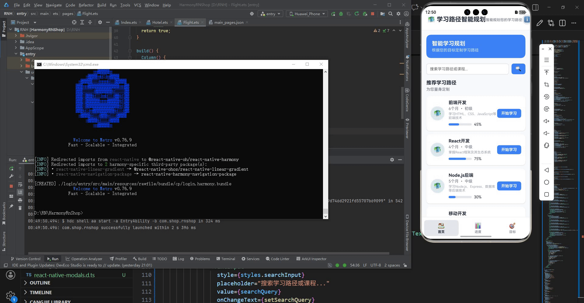
打包
接下来通过打包命令npn run harmony将reactNative的代码打包成为bundle,这样可以进行在开源鸿蒙OpenHarmony中进行使用。

打包之后再将打包后的鸿蒙OpenHarmony文件拷贝到鸿蒙的DevEco-Studio工程目录去:

最后运行效果图如下显示:
欢迎大家加入开源鸿蒙跨平台开发者社区,一起共建开源鸿蒙跨平台生态。

社区规范:仅讨论OpenHarmony相关问题。
更多推荐
 27
27 0
0- 0


 已为社区贡献5条内容

所有评论(0)