OpenHarmony轻智能设备JS应用的多分辨率适配
·
OpenHarmony轻智能设备JS应用的多分辨率适配
目前市场上的轻智能设备例如运动手表,有不同形状和分辨率的屏幕,给消费者提供了多种选择。在为OpenHarmony轻智能设备开发JS应用时,我们希望应用能自适应不同形状和分辨率的屏幕,做到在不同大小的轻智能上灵活调整应用页面的布局。
本文提供了在DevEco Studio上开发OpenHarmony轻智能设备的JS应用适配不同分辨率屏幕的一种方法。
弹性的应用页面布局
不同形状和分辨率的设备,主要影响的是应用页面中组件的布局。在设计应用页面时,组件的大小、位置设置为相对值,就能够适配不同分辨率的设备屏幕。
以猜数字的应用为例,上方有个input的区域,中间是display区域。

<!-- index.hml -->
<div class="container" onswipe="QuitApp">
    <stack class="background">
        <div class="game">
            <div class="input">
                <text class="input_text">{{inputNum}}</text>
                <input class="intput_button">{{$t('strings.input')}}</input>
            </div>
            <div class="display">
                ...
            </div>
        </div>
    </stack>
</div>
在对应的css文件中,组件的width、height属性尽量不使用固定的像素值设置大小,而是使用相对父组件的百分比来设置,这样的页面布局可以更加灵活适应不同形状和分辨率。
.container {
  width: 100%;
  height: 100%;
  justify-content: center;
  align-items: center;
  flex-direction: column;
}
.background {
  width: 100%;
  height: 100%;
  background-color: azure;
}
.game {
  width: 100%;
  height: 100%;
  justify-content: center;
  align-items: center;
  flex-direction: column;
}
.input {
  width:60%;
  height: 10%;
  justify-content: center;
  align-items: center;
}
.display {
  width:80%;
  height: 45%;
  justify-content: center;
  align-items: center;
  flex-direction: column;
}
.intput_button {
  width: 40%;
  height: 90%;
  margin-left: 10%;
  font-size: 22px;
  color: white;
  border-radius:6px;
}
.input_text {
  width: 40%;
  height: 90%;
  text-align: center;
  color: black;
  background-color: white;
  border-color: lightslategray;
  border-width: 1px;
  border-radius:6px;
  font-size:30px;
  letter-spacing:5px;
}
......
根据设备信息数据对页面进行微调
在应用页面弹性的布局基础上,根据设备屏幕的分辨率、形状对组件做微调,让其中的组件在不同比例的轻智能设备上的布局更合理。
继续以之前的应用为例,在index.js文件中通过获取设备信息的接口device.getInfo得到设备的形状、分辨率。
import device from '@system.device';
export default {
data: {
circleScreen: true, // 屏幕形状:圆形、矩形
smallScreen: false,
....
},
GetScreenInfo() {
var that = this;
device.getInfo({
success: function(data) {
console.log('Device information obtained successfully.');
console.log('screen shape:' + data.screenShape + ', width/height:' + data.windowWidth +
'/' + data.windowHeight);
if (data.screenShape == "rect") {
that.circleScreen = false;
} else {
that.circleScreen = true;
}
if (data.windowWidth == data.windowHeight) {
// 正方形与圆形的屏幕布局可以是一致的
that.circleScreen = true;
// 圆形屏幕分辨率为360时,属于小屏幕设备,应用中的文字字号要相应调小
if (data.windowWidth == 360) {
that.smallScreen = true;
}
}
},
fail: function(data, code) {
console.log('Failed to obtain device information. Error code:'+ code + '; Error information: ' + data);
},
});
},
// onInit中调用GetScreenInfo获取屏幕信息
onInit() {
this.GetScreenInfo();
......
},
}
使用条件渲染,根据设备屏幕的形状、分辨率来动态调整组件及文字的大小,使页面布局适配不同的分辨率。
将css样式中不同分辨率下需要动态调整的属性width、font-size等单独提取出来在hml中设置。
<!-- index.hml -->
<div class="container" onswipe="QuitApp">
<stack class="background">
<div class="game">
<div class="input" style="width:60%;" if="{{circleScreen}}">
<text class="input_text" style="font-size:30px;letter-spacing:5px;" if="{{!smallScreen}}">{{inputNum}}</text>
<text class="input_text" style="font-size:25px;letter-spacing:2px;" if="{{smallScreen}}">{{inputNum}}</text>
<input class="intput_button" type="button" onclick="OnClickInput">{{$t('strings.input')}}</input>
</div>
<div class="input" style="width:80%;" if="{{!circleScreen}}">
<text class="input_text" style="font-size:30px;letter-spacing: 5px;" if="{{!smallScreen}}">{{inputNum}}</text>
<text class="input_text" style="font-size:25px;letter-spacing: 2px;" if="{{smallScreen}}">{{inputNum}}</text>
<input class="intput_button" type="button" onclick="OnClickInput">{{$t('strings.input')}}</input>
</div>
<div class="display" style="width:80%;" if="{{circleScreen}}">
...
</div>
<div class="display" style="width:90%;" if="{{!circleScreen}}">
...
</div>
</div>
</stack>
</div>
...
.input {
  height: 10%;
  justify-content: center;
  align-items: center;
}
.input_text {
  width: 40%;
  height: 90%;
  text-align: center;
  color: black;
  background-color: white;
  border-color: lightslategray;
  border-width: 1px;
  border-radius:6px;
}
.intput_button {
  width: 40%;
  height: 90%;
  margin-left: 10%;
  font-size: 22px;
  color: white;
  border-radius:6px;
}
.display {
  height: 45%;
  justify-content: center;
  align-items: center;
  flex-direction: column;
}
...
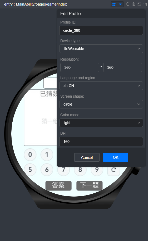
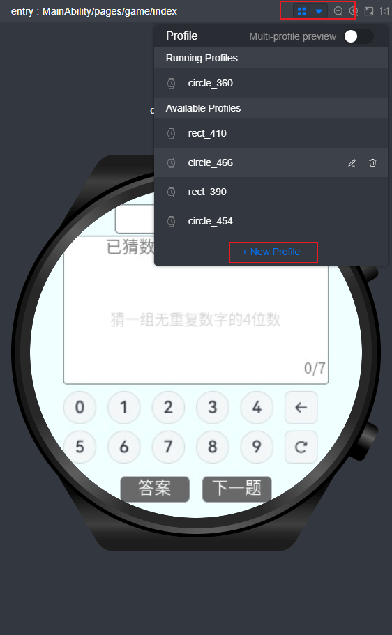
IDE中设置多分辨率的预览
在DevEco Studio的预览器中可以选择不同的profile来预览不同形状、分辨率下的应用页面。IDE中有默认的穿戴设备的profile,我们可以创建多个profile进行预览,来调整应用页面的布局。
-
选择profile进行预览

-
创建新的profile

社区规范:仅讨论OpenHarmony相关问题。
更多推荐
 0
0 0
0- 0


 已为社区贡献40条内容

所有评论(0)