OpenHarmony使用eTS语言开发
eTS基础介绍
eTS是极简声明式UI范式开发语言,属于方舟开发框架(简称:ArkUI)的一种 基于TS扩展的声明式开发范式
说明:方舟开发框架是一套开发极简、高性能、跨设备应用设计研发的UI开发框架,支持开发者高效的构建跨设备应用UI界面。
基础能力
采用更接近自然语义的编程方式,让开发者可以直观地描述UI界面,不必关心框架如何实现UI绘制和渲染,实现极简高效开发。从组件、动效和状态管理三个维度来提供UI能力,还提供了系统能力接口,实现系统能力的极简调用。
-
开箱即用的组件
框架提供丰富的系统预置组件,可以通过链式调用的方式设置系统组件的渲染效果。开发者可以组合系统组件为自定义组件,通过这种方式将页面组件化为一个个独立的UI单元,实现页面不同单元的独立创建、开发和复用,使页面具有更强的工程性。
-
丰富的动效接口
提供svg标准的绘制图形能力,同时开放了丰富的动效接口,开发者可以通过封装的物理模型或者调用动画能力接口来实现自定义动画轨迹。
-
状态与数据管理
状态数据管理作为基于TS扩展的声明式开发范式的特色,通过功能不同的装饰器给开发者提供了清晰的页面更新渲染流程和管道。状态管理包括UI组件状态和应用程序状态,两者协作可以使开发者完整地构建整个应用的数据更新和UI渲染。
-
系统能力接口
使用基于TS扩展的声明式开发范式的方舟开发框架,还封装了丰富的系统能力接口,开发者可以通过简单的接口调用,实现从UI设计到系统能力调用的极简开发。
声明式UI描述规范
基本概念
声明式语法定义了基于TS扩展的声明式开发范式的核心机制和功能,包含了声明式UI描述、组件化机制、UI状态管理、渲染控制语法和语法糖。
基于TS扩展的声明式开发范式提供了一系列基础组件,这些组件以声明方式进行组合和扩展来描述应用程序的UI界面,并且还提供了基本的数据绑定和事件处理机制,帮助开发者实现应用交互逻辑。
-
基本示例
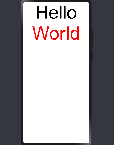
@Entry @Component struct Hello { @State myText: string = 'World' build() { Column() { Text('Hello') .fontSize(30) Text(this.myText) .fontSize(32) Divider() Button() { Text('Click me') .fontColor(Color.Red) .fontSize(30) }.onClick(() => { this.myText = 'UI' }) .width(200) .height(100) } } }


上述示例代码描述了简单页面的结构,并介绍了以下基本概念:
-
装饰器:方舟开发框架定义了一些具有特殊含义的装饰器,用于装饰类、结构、方法和变量。例如,上例中的@Entry、@Component和@State都是装饰器。
-
自定义组件:可重用的UI单元,可以与其他组件组合,如@Component装饰的struct Hello。
-
UI描述:声明性描述UI结构,例如build()方法中的代码块。
-
内置组件:框架中默认内置的基本组件和布局组件,开发者可以直接调用,如Column、Text、Divider、Button等。
-
属性方法:用于配置组件属性,如fontSize()、width()、height()、color()等。
-
事件方法:在事件方法的回调中添加组件响应逻辑。例如,为Button组件添加onClick方法,在onClick方法的回调中添加点击响应逻辑。
无参数构造配置
组件的接口定义不包含必选构造参数,组件后面的“()”中不需要配置任何内容。
例如,Divider组件不包含构造参数:
Column() { Text('item 1') Divider() Text('item 2') }
必选参数构造配置
如果组件的接口定义中包含必选构造参数,则在组件后面的“()”中必须配置参数,参数可以使用常量进行赋值。
例如:
-
Image组件的必选参数src,Text组件的必选参数content
Image('http://xyz/a.jpg') Text('123')
变量或表达式也可以用于参数赋值,其中表达式返回的结果类型必须满足参数类型要求。
-
传递变量或表达式来构造Image和Text组件的参数:
//imageUrl是组件中定义的私有数据变量。 Image('http://' + this.imageUrl) //count是组件中定义的私有数据变量。 //(``)和(${})是TS语言支持的模板字符串特征,符合相应语言的特征。本规范不受限制。 Text(`count: ${this.count}`)
属性配置
使用属性方法配置组件的属性,属性方法紧随组件,并用“ . ”运算符连接。
-
使用“ . ”操作进行链式调用并同时配置组件的多个属性。
Image('a.jpg') .alt('error.jpg') .width(100) .height(100)
-
除了直接传递常量参数外,还可以传递变量或表达式。
//size,count,offset都是组件中定义的私有变量。 Text('hello') .fontSize(this.size) Image('a.jpg') .width(this.count % 2 === 0 ? 100 : 200) .height(this.offset + 100)
-
对于内置组件,框架还为其属性预定义了一些枚举类型,供开发人员调用,枚举值可以作为参数传递。枚举类型必须满足参数类型要求,有关特定属性的枚举类型定义的详细信息。可以按以下方式配置Text组件的颜色和字体属性:
Text('hello') .fontSize(20) .fontColor(Color.Red) .fontWeight(FontWeight.Bold)
事件配置
通过事件方法可以配置组件支持的事件。
-
使用lambda表达式配置组件的事件方法:
//counter是组件中定义的私有数据变量 Button('add counter') .onClick(() => { this.counter += 2 })
-
使用匿名函数表达式配置组件的事件方法,要求使用bind,以确保函数体中的this引用包含的组件:
//counter是组件中定义的私有数据变量 Button('add counter') .onClick(function () { this.counter += 2 }.bind(this))
-
使用组件的成员函数配置组件的事件方法:
//counter是组件中定义的私有数据变量 myClickHandler(): void { this.counter += 2 } Button('add counter') .onClick(this.myClickHandler)
子组件配置
对于支持子组件配置的组件,例如容器组件,在“{ ... }”里为组件添加子组件的UI描述。Column、Row、Stack、Button、Grid和List组件都是容器组件。
-
以下是简单的Column示例:
Column() { Text('Hello') .fontSize(100) Divider() Text('World') .fontSize(100) .fontColor(Color.Red) }
-
可以嵌套多个子组件:
@Entry @Component struct Index { build() { Column() { Column() { Button() { Text('+ 1') .fontSize(30) } .width("50%") .height("10%") .margin({bottom:20}) .type(ButtonType.Capsule) .onClick(() => console.log ('+1 clicked!')) } Column() { Button() { Text('+ 2') .fontSize(30) } .width("50%") .height("10%") .margin({bottom:20}) .type(ButtonType.Capsule) .onClick(() => console.log ('+2 clicked!')) } Column() { Button() { Text('+ 3') .fontSize(30) } .width("50%") .height("10%") .type(ButtonType.Capsule) .onClick(() => console.log ('+3 clicked!')) } } .width("100%") .height("100%") .alignItems(HorizontalAlign.Center) } }


组件化&装饰器
@Component
@Component装饰的struct表示该结构体具有组件化能力,能够成为一个独立的组件,这种类型的组件也称为自定义组件,在build方法里描述UI结构。自定义组件具有以下特点:
-
可组合:允许开发人员组合使用内置组件、其他组件、公共属性和方法;
-
可重用:自定义组件可以被其他组件重用,并作为不同的实例在不同的父组件或容器中使用;
-
生命周期:生命周期的回调方法可以在组件中配置,用于业务逻辑处理;
-
数据驱动更新:由状态变量的数据驱动,实现UI自动更新。
说明:自定义组件必须定义build方法,自定义组件禁止自定义构造函数。
如下代码定义了MyComponent组件:
@Component struct MyComponent { build() { Column() { Text('my component') .fontColor(Color.Red) .fontSize(30) }.alignItems(HorizontalAlign.Center) } }
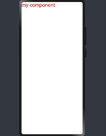
MyComponent的build方法会在初始渲染时执行,此外,当组件中的状态发生变化时,build方法将再次执行。
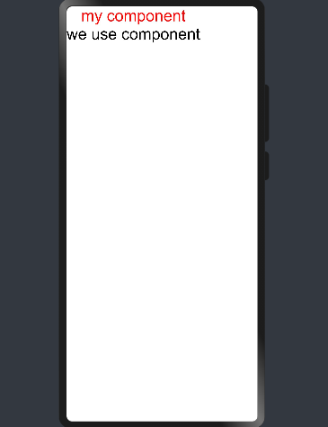
以下代码使用了MyComponent组件:
@Component struct ParentComponent { build() { Column() { MyComponent() Text('we use component') .fontSize(30) } } }
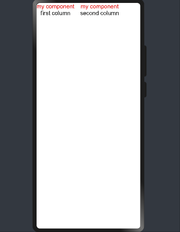
可以多次使用MyComponent,并在不同的组件中进行重用:
@Component struct ParentComponent { build() { Row() { Column() { MyComponent() Text('first column') .fontSize(20) } .margin({right:20}) Column() { MyComponent() Text('second column') .fontSize(20) } } } private aboutToAppear() { console.log('ParentComponent: Just created, about to become rendered first time.') } private aboutToDisappear() { console.log('ParentComponent: About to be removed from the UI.') } }
@Entry
用@Entry装饰的自定义组件用作页面的默认入口组件,加载页面时,将首先创建并呈现@Entry装饰的自定义组件。
说明:在单个源文件中,最多可以使用@Entry装饰一个自定义组件。
@Preview
用@Preview装饰的自定义组件可以在DevEco Studio的预览器上进行预览,加载页面时,将创建并呈现@Preview装饰的自定义组件。
说明:在单个源文件中,最多可以使用@Preview装饰一个自定义组件。
@Builder
@Builder装饰的方法用于定义组件的声明式UI描述,在 一个自定义组件内快速生成多个布局内容。@Builder装饰方法的功能和语法规范与build函数相同。
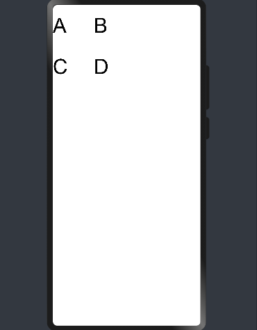
@Entry @Component struct CompA { @State length : number = 100; @Builder SquareText(label: string) { Text(label) .fontSize(50) .width(1 * this.length) .height(1 * this.length) } @Builder RowOfSquareTexts(label1: string, label2: string) { Row() { this.SquareText(label1) this.SquareText(label2) } .width(2 * this.length) .height(1 * this.length) } build() { Column() { Row() { this.SquareText("A") this.SquareText("B") // or as long as tsc is used } .width(2 * this.length) .height(1 * this.length) this.RowOfSquareTexts("C", "D") } .width(2 * this.length) .height(2 * this.length) } }
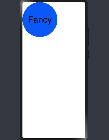
@Extend
@Extend装饰器将新的属性函数添加到内置组件上,如Text、Column、Button等。通过@Extend装饰器可以快速定义并复用组件的自定义样式。
@Extend装饰器不能用在自定义组件struct定义框内。
@Extend(Text) function fancy(fontSize: number) { .fontColor(Color.Red) .fontSize(fontSize) .fontStyle(FontStyle.Italic) } @Entry @Component struct FancyUse { build() { Row({ space: 10 }) { Text("Fancy") .fancy(30) Text("Fancy") .fancy(50) } } }


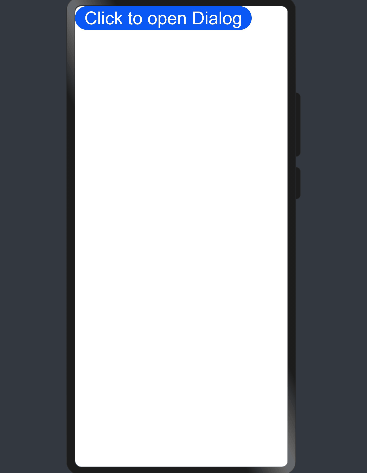
@CustomDialog
@CustomDialog装饰器用于装饰自定义弹窗。
@CustomDialog struct DialogExample { controller: CustomDialogController; action: () => void; build() { Row() { Text ("Close CustomDialog") .fontSize(30) .onClick(() => { this.controller.close(); this.action(); }) } } } @Entry @Component struct CustomDialogUser { dialogController : CustomDialogController = new CustomDialogController({ builder: DialogExample({action: this.onAccept}), cancel: this.existApp, autoCancel: true }); onAccept() { console.log("onAccept"); } existApp() { console.log("Cancel dialog!"); } build() { Column() { Button("Click to open Dialog") .onClick(() => { this.dialogController.open() }) .fontSize(30) } } }

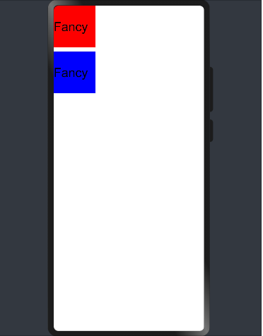
@Styles
@Styles装饰器将新的属性函数添加到基本组件上,如Text、Column、Button等。当前@Styles仅支持通用属性。通过@Styles装饰器可以快速定义并复用组件的自定义样式。
@Styles可以定义在组件内或组件外,在组件外定义时需带上function关键字,组件内定义时不需要。
@Styles function globalFancy() { .backgroundColor(Color.Red) } @Entry @Component struct FancyUse { @Styles componentFancy() { .backgroundColor(Color.Blue) } build() { Column({ space: 10 }) { Text("Fancy") .globalFancy() .width(100) .height(100) .fontSize(30) Text("Fancy") .componentFancy() .width(100) .height(100) .fontSize(30) } } }
@Styles还可以在StateStyles属性内部使用,在组件处于不同的状态时赋予相应的属性。
在StateStyles内可以直接调用组件外定义的Styles,但需要通过this关键字调用组件内定义的Styles。
@Styles function globalFancy() { .width(200) .height(200) } @Entry @Component struct FancyUse { @Styles componentFancy() { .width(200) .height(200) } build() { Row({ space: 10 }) { Button() { Text("Fancy") .fontSize(50) } .stateStyles({ normal: { .width(200) .height(200) }, disabled: this.componentFancy, pressed: globalFancy }) } } }
UI状态管理
基本概念
在声明式UI编程范式中,UI是应用程序状态的函数,开发人员通过修改当前应用程序状态来更新相应的UI界面。
如下图所示,开发框架提供了多种应用程序状态管理的能力。


状态变量装饰器
-
@State:组件拥有的状态属性,当@State装饰的变量更改时,组件会重新渲染更新UI。
-
@Link:组件依赖于其父组件拥有的某些状态属性,当任何一个组件中的数据更新时,另一个组件的状态都会更新,父子组件重新渲染。
-
@Prop:原理类似@Link,但是子组件所做的更改不会同步到父组件上,属于单向传递。
说明: 状态变量名称不能使用id,如@Prop id:number 。
应用程序状态数据
AppStorage是整个UI应用程序状态的中心“数据库”,UI框架会针对应用程序创建单例AppStorage对象,并提供相应的装饰器和接口供应用程序使用。
-
@StorageLink:@StorageLink(name)的链接对象是从AppStorage中获得的,在UI组件和AppStorage之间建立双向绑定同步数据。
-
@StorageProp:@StorageProp(name)将UI组件属性与AppStorage进行单向同步,AppStorage中值的更改会更新组件中的属性,但UI组件无法更改AppStorage中的属性值。
-
AppStorage还提供用于业务逻辑实现的API,用于添加、读取、修改和删除应用程序的状态属性,此API所做的更改会导致修改的状态数据同步到UI组件上进行UI更新。
管理组件拥有的状态
@State
@State装饰的变量是组件内部的状态数据,当这些状态数据被修改时,将会调用所在组件的build方法进行UI刷新。
@State状态数据具有以下特征:
-
支持多种类型:允许class、number、boolean、string强类型的按值和按引用类型。允许这些强类型构成的数组,即Array<class>、Array<string>、Array<boolean>、Array<number>。不允许object和any。
-
支持多实例:组件不同实例的内部状态数据独立。
-
内部私有:标记为@State的属性是私有变量,只能在组件内访问。
-
需要本地初始化:必须为所有@State变量分配初始值,将变量保持未初始化可能导致框架行为未定义。
-
创建自定义组件时支持通过状态变量名设置初始值:在创建组件实例时,可以通过变量名显式指定@State状态属性的初始值。
简单类型的状态属性示例
@Entry @Component struct MyComponent { @State count: number = 0 //MyComponent提供修改@State状态数据成员的方法 private toggleClick() { this.count += 1 } build() { Column() { Row() { Button() { Text(`click times: ${this.count}`) .fontSize(30) .fontWeight(FontWeight.Bold) } .height(60) .width('80%') .onClick(this.toggleClick.bind(this)) } .height('100%') } .width('100%') } }


复杂类型的状态变量示例
//自定义状态数据类 class Model { value: string constructor(value: string) { this.value = value } } @Entry @Component struct EntryComponent { build() { Column() { MyComponent({ count: 1, increaseBy: 2 }).margin(50) MyComponent({ title: { value: 'Hello World' }, count: 7 }) } .width('100%') } } @Component struct MyComponent { @State title: Model = { value: 'Hello' } @State count: number = 0 private toggle: string = 'Hello' private increaseBy: number = 1 build() { Column() { Text(`${this.title.value}`) .fontSize(30) .fontWeight(FontWeight.Bold) Button() { Text(`change title`) .fontSize(30) .fontWeight(FontWeight.Bold) .fontColor(Color.White) } .height(40) .margin(10) .onClick(() => { // toggle变量值是否为'Hello' this.title.value = (this.toggle == this.title.value) ? 'Hello World' : 'Hello UI' }) //使用匿名方法修改MyComponent内部状态 Button() { Text(`increase count=${this.count}`) .fontSize(30) .fontWeight(FontWeight.Bold) .fontColor(Color.White) } .height(40) .onClick(() => { this.count += this.increaseBy }) //使用匿名方法修改MyComponent内部状态 } } }

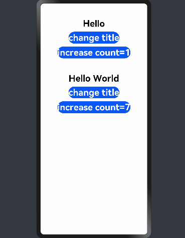
在上述示例中:
-
用户定义的组件MyComponent定义了@State状态变量count和title。如果count或title的值发生变化,则执行MyComponent的build方法来重新渲染组件;
-
EntryComponent中有多个MyComponent组件实例,第一个MyComponent内部状态的更改不会影响第二个MyComponent;
-
创建MyComponent实例时通过变量名给组件内的变量进行初始化,如:
MyComponent({title: {value: 'Hello, World 2'}, count: 7})
@Prop
@Prop与@State有相同的语义,但初始化方式不同。@Prop装饰的变量必须使用其父组件提供的@State变量进行初始化,允许组件内部修改@Prop变量,但更改不会通知给父组件,即@Prop属于单向数据绑定。
@Prop状态数据具有以下特征:
-
支持简单类型:仅支持number、string、boolean简单类型;
-
私有:仅在组件内访问;
-
支持多个实例:一个组件中可以定义多个标有@Prop的属性;
-
创建自定义组件时将值传递给@Prop变量进行初始化:在创建组件的新实例时,必须初始化所有@Prop变量,不支持在组件内部进行初始化。
示例
@Entry @Component struct ParentComponent { @State countDownStartValue: number = 10 //游戏中的10个掘金默认起始值 build() { Column() { Text(`Grant ${this.countDownStartValue} nuggets to play.`) Button() { Text('+1 - Nuggets in New Game') }.onClick(() => { this.countDownStartValue += 1 }) Button() { Text('-1 - Nuggets in New Game') }.onClick(() => { this.countDownStartValue -= 1 }) // 创建子组件时,必须在构造函数参数中提供其@Prop变量的初始值,同时初始化常规变量CostOfOneAttump(非Prop) CountDownComponent({ count: this.countDownStartValue, costOfOneAttempt: 2}) } } } @Component struct CountDownComponent { @Prop count: number private costOfOneAttempt: number build() { Column() { if (this.count > 0) { Text(`You have ${this.count} Nuggets left`) } else { Text('Game over!') } Button() { Text('Try again') }.onClick(() => { this.count -= this.costOfOneAttempt }) } } }


在上述示例中,当按“+1”或“-1”按钮时,父组件状态发生变化,重新执行build方法,此时将创建一个新的CountDownComponent组件。父组件的countDownStartValue状态属性被用于初始化子组件的@Prop变量,当按下子组件的“Try again”按钮时,其@Prop变量count将被更改,CountDownComponent重新渲染。但是count值的更改不会影响父组件的countDownStartValue值。
@Link
@Link装饰的变量可以和父组件的@State变量建立双向数据绑定:
-
支持多种类型:@Link变量的值与@State变量的类型相同,即class、number、string、boolean或这些类型的数组;
-
私有:仅在组件内访问;
-
单个数据源:初始化@Link变量的父组件的变量必须是@State变量;
-
双向通信:子组件对@Link变量的更改将同步修改父组件的@State变量;
-
创建自定义组件时需要将变量的引用传递给@Link变量,在创建组件的新实例时,必须使用命名参数初始化所有@Link变量。@Link变量可以使用@State变量或@Link变量的引用进行初始化,@State变量可以通过
'$'操作符创建引用。
说明: @Link变量不能在组件内部进行初始化。
简单类型示例
@Entry @Component struct Player { @State isPlaying: boolean = false build() { Column() { PlayButton({ buttonPlaying: $isPlaying }) Text(`Player is ${this.isPlaying? '':'not'} playing`) .fontSize(30) .fontWeight(FontWeight.Bold) } } } @Component struct PlayButton { @Link buttonPlaying: boolean build() { Column() { Button() { Text(this.buttonPlaying ? 'play' : 'pause') .fontSize(25) .fontWeight(FontWeight.Bold) } .height(60) .width('100%') .onClick(() => { this.buttonPlaying = !this.buttonPlaying }) } } }


@Link语义是从'$'操作符引出,即$isPlaying是this.isPlaying内部状态的双向数据绑定。当单击子组件PlayButton时,PlayButton中的Text和父组件Player中的Text将同时进行刷新。
复杂类型示例
@Entry @Component struct Parent { @State arr: number[] = [1, 2, 3] build() { Column() { Child({ items: $arr }).margin(10) ForEach(this.arr, item => Text(`${item}`).fontSize(30).fontWeight(FontWeight.Bold), item => item.toString()) } .width('100%') } } @Component struct Child { @Link items: number[] build() { Column() { Button() { Text('Button1: push') .fontSize(25) .fontWeight(FontWeight.Bold) } .height(60) .width('90%') .margin(10) .onClick(() => { this.items.push(100) }) Button() { Text('Button2: replace whole item') .fontSize(25) .fontWeight(FontWeight.Bold) } .height(60) .width('90%') .onClick(() => { this.items = [100, 200, 300] }) } } }


在上面的示例中,点击Button1和Button2更改父组件中显示的文本项目列表。
@Link、@State和@Prop结合使用示例
@Entry @Component struct ParentView { @State counter: number = 0 build() { Column() { ChildA({ counterVal: this.counter }).margin(10) //按值传递 ChildB({ counterRef: $counter }) //$创建一个可以绑定到counterRef的引用 } .width('100%') } } @Component struct ChildA { @Prop counterVal: number build() { Button() { Text(`ChildA: (${this.counterVal}) + 1`) .fontSize(25) .fontWeight(FontWeight.Bold) } .height(60) .width(240) .onClick(() => { this.counterVal += 1 }) } } @Component struct ChildB { @Link counterRef: number build() { Button() { Text(`ChildB: (${this.counterRef}) + 1`) .fontSize(25) .fontWeight(FontWeight.Bold) } .height(60) .width(240) .onClick(() => { this.counterRef += 1 }) } }


上述示例中,ParentView包含ChildA和ChildB两个子组件,ParentView的状态变量counter分别初始化ChildA和ChildB。
-
ChildA使用@Prop建立从ParentView到自身的单向状态绑定。当ChildA修改状态时,ChildA将重新渲染,但该更改不会传达给ParentView和ChildB。
-
ChildB使用@Link建立双向状态绑定。当ChildB修改counterRef状态变量值时,该更改将同步到ParentView和ChildA共享。
管理应用程序的状态
应用程序的数据存储
AppStorage是应用程序中的单例对象,由UI框架在应用程序启动时创建,在应用程序退出时销毁,为应用程序范围内的可变状态属性提供中央存储。AppStorage包含整个应用程序中需要访问的所有状态属性,只要应用程序保持运行,AppStorage就会保存所有属性及属性值,属性值可以通过唯一的键值进行访问。
UI组件可以通过装饰器将应用程序状态数据与AppStorage进行同步,应用业务逻辑的实现也可以通过接口访问AppStorage。
AppStorage的选择状态属性可以与不同的数据源或数据接收器同步,这些数据源和接收器可以是设备上的本地或远程,并具有不同的功能,如数据持久性。这样的数据源和接收器可以独立于UI在业务逻辑中实现。
默认情况下,AppStorage中的属性是可变的,AppStorage还可使用不可变(只读)属性。
AppStorage接口
| 方法 | 参数说明 | 返回值 | 定义 |
|---|---|---|---|
| SetAndLink | key: string, defaultValue: T | @Link | 与Link接口类似,如果当前的key保存于AppStorage,则返回该key对应的value。如果该key未被创建,则创建一个对应default值的Link返回。 |
| Set | key: string, newValue: T | void | 对已保存的key值,替换其value值。 |
| Link | key: string | @Link | 如果存在具有给定键的数据,则返回到此属性的双向数据绑定,该双向绑定意味着变量或者组件对数据的更改将同步到AppStorage,通过AppStorage对数据的修改将同步到变量或者组件。如果具有此键的属性不存在或属性为只读,则返回undefined。 |
| SetAndProp | propName: string, defaultValue: S | @Prop | 与Prop接口类似,如果当前的key保存于AppStorage,则返回该key对应的value。如果该key未被创建,则创建一个对应default值的Prop返回。 |
| Prop | key: string | @Prop | 如果存在具有给定键的属性,则返回此属性的单向数据绑定。该单向绑定意味着只能通过AppStorage将属性的更改同步到变量或者组件。该方法返回的变量为不可变变量,适用于可变和不可变的状态属性,如果具有此键的属性不存在则返回undefined。 (prop方法对应的属性值类型为简单类型) |
| SetOrCreate | key: string, newValue: T | boolean | 如果已存在与给定键名字相同的属性,如果此属性可以被更改则替换其value值且返回true,否则不替换且返回false。 如果不存在存在与给定键名字相同的属性, 则创建一个键为key, 值为newValue的属性,属性值不支持null和undefined。 |
| Get | key: string | T或undefined | 通过此接口获取对应key值的value。 |
| Has | propName: string | boolean | 判断对应键值的属性是否存在。 |
| Keys | void | array | 返回包含所有键的字符串数组。 |
| Delete | key: string | boolean | 删除key指定的键值对,如果存在且删除成功返回true,不存在或删除失败返回false。 |
| Clear | void | boolean | 删除所有的属性,如果当前有状态变量依旧引用此属性,则返回false。 |
| IsMutable | key: string | boolean | 返回此属性是否存在并且是否可以改变。 |
说明: 当前接口当前仅可以处理基础类型数据,对于修改object中某一个值尚未支持。
AppStorage与组件同步
实现组件变量与AppStorage同步,主要提供@StorageLink和@StorageProp装饰器。
@StorageLink装饰器
组件通过使用@StorageLink(key)装饰的状态变量,与AppStorage建立双向数据绑定,key为AppStorage中的属性键值。当创建包含@StorageLink的状态变量的组件时,该状态变量的值将使用AppStorage中的值进行初始化。在UI组件中对@StorageLink的状态变量所做的更改将同步到AppStorage,并从AppStorage同步到任何其他绑定实例中,如PersistentStorage或其他绑定的UI组件。
@StorageProp装饰器
组件通过使用@StorageProp(key)装饰的状态变量,将与AppStorage建立单向数据绑定,key标识AppStorage中的属性键值。当创建包含@StoageProp的状态变量的组件时,该状态变量的值将使用AppStorage中的值进行初始化。AppStorage中的属性值的更改会导致绑定的UI组件进行状态更新。
示例
let varA = AppStorage.Link('varA') let envLang = AppStorage.Prop('languageCode') @Entry @Component struct ComponentA { @StorageLink('varA') varA: number = 1 @StorageProp('languageCode') lang: string = 'en' private label: string = 'count' aboutToAppear() { this.label = (this.lang === 'zh') ? '数' : 'Count' } build() { Column() { Button() { Text(`${this.label}: ${this.varA}`) .fontSize(25) .fontWeight(FontWeight.Bold) } .height(60) .width('80%') .margin(10) .onClick(() => { AppStorage.Set < number > ('varA', AppStorage.Get < number > ('varA') + 1) }) Button() { Text(`lang: ${this.lang}`) .fontSize(25) .fontWeight(FontWeight.Bold) } .height(60) .width('80%') .onClick(() => { if (this.lang === 'zh') { AppStorage.Set < string > ('languageCode', 'en') } else { AppStorage.Set < string > ('languageCode', 'zh') } this.label = (this.lang === 'zh') ? '数' : 'Count' }) } .width('100%') } }


上述示例中,每次用户单击Count按钮时,this.varA变量值都会增加,此变量与AppStorage中的varA同步。每次用户单击当前语言按钮时,修改AppStorage中的languageCode,此修改会同步给this.lang变量。
持久化数据管理
方舟开发框架通过PersistentStorage类提供了一些静态方法用来管理应用持久化数据,可以将特定标记的持久化数据链接到AppStorage中,并由AppStorage接口访问对应持久化数据,或者通过@StorageLink装饰器来访问对应key的变量。
| 方法 | 参数说明 | 返回值 | 定义 |
|---|---|---|---|
| PersistProp | key : string defaultValue: T | void | 关联命名的属性在AppStorage变为持久化数据,赋值覆盖顺序如下: - 首先,如果该属性存在于AppStorage,将Persistent中的数据复写为AppStorage中的属性值。 - 其次,Persistent中有此命名的属性,使用Persistent中的属性值。 - 最后,以上条件均不满足,则使用defaultValue,不支持null和undefined。 |
| DeleteProp | key: string | void | 取消双向数据绑定,该属性值将从持久存储中删除。 |
| PersistProps | keys: { key: string, defaultValue: any }[] | void | 关联多个命名的属性绑定。 |
| Keys | void | Array | 返回所有持久化属性的标记。 |
说明:
PersistProp接口使用时,需要保证输入对应的key应当在AppStorage存在。
DeleteProp接口使用时,只能对本次启动已经link过的数据生效。
PersistentStorage.PersistProp("highScore", "0"); @Entry @Component struct PersistentComponent { @StorageLink('highScore') highScore: string = '0' @State currentScore: number = 0 build() { Column() { if (this.currentScore === Number(this.highScore)) { Text(`new highScore: ${this.highScore}`) .fontSize(30) .fontWeight(FontWeight.Bold) } Button() { Text(`goal!, currentScore : ${this.currentScore}`) .fontSize(25) .fontWeight(FontWeight.Bold) } .height(60) .width('80%') .margin(10) .onClick(() => { this.currentScore++ if (this.currentScore > Number(this.highScore)) { this.highScore = this.currentScore.toString() } }) } .width('100%') } }


环境变量
Environment是框架在应用程序启动时创建的单例对象,它为AppStorage提供了一系列应用程序需要的环境状态属性,这些属性描述了应用程序运行的设备环境。Environment及其属性是不可变的,所有属性值类型均为简单类型。如下示例展示了从Environment获取语音环境:
Environment.EnvProp("accessibilityEnabled", "default"); var enable = AppStorageGet("accessibilityEnabled");
accessibilityEnabled是Environment提供默认系统变量识别符。首先需要将对应系统属性绑定到AppStorage中,再通过AppStorage中的方法或者装饰器访问对应系统的属性数据。
Environment接口
| key | 参数 | 返回值 | 说明 |
|---|---|---|---|
| EnvProp | key: string, defaultValue: any | boolean | 关联此系统项到AppStorage中,建议在app启动时使用此接口。如果该属性在AppStorage已存在,返回false。请勿使用AppStorage中的变量,在调用此方法关联环境变量。 |
| EnvProps | keys: { key: string, defaultValue: any }[] | void | 关联此系统项数组到AppStorage中。 |
| Keys | Array | number | 返回关联的系统项。 |
Environment内置的环境变量
| key | 类型 | 说明 |
|---|---|---|
| accessibilityEnabled | boolean | 无障碍屏幕朗读是否启用。 |
| colorMode | ColorMode | 深浅色模式,可选值为: - ColorMode.LIGHT:浅色模式; - ColorMode.DARK:深色模式。 |
| fontScale | number | 字体大小比例,取值范围为[0.85, 1.45]。 |
| fontWeightScale | number | 字体权重比例,取值范围为[0.6, 1.6]。 |
| layoutDirection | LayoutDirection | 布局方向类型,可选值为: - LayoutDirection.LTR:从左到右; - LayoutDirection.RTL:从右到左。 |
| languageCode | string | 设置当前系统的语言,小写字母,例如zh。 |
其他类目的状态管理
@Observed和@ObjectLink数据管理
-
@Observed应用于类,表示该类中的数据变更被UI页面管理,例如:@Observed class ClassA {}。
-
@ObjectLink应用于被@Observed所装饰类的对象,例如:@ObjectLink a: ClassA。
引入动机
当开发者需要在子组件中针对父组件的一个变量(parent_a)设置双向同步时,开发者可以在父组件中使用@State装饰变量(parent_a),并在子组件中使用@Link装饰相应的变量(child_a)。这样的话,不仅可以实现父组件与单个子组件之间的数据同步,也可以实现父组件与多个子组件之间的数据同步。如下图所示,可以看到,父子组件针对ClassA类型的变量设置了双向同步,那么当子组件1中变量的属性c的值变化时,会通知父组件同步变化,而当父组件中属性c的值变化时,会通知所有子组件同步变化。


然而,上述例子是针对某个数据对象进行的整体同步,而当开发者只想针对父组件中某个数据对象的部分信息进行同步时,使用@Link就不能满足要求。如果这些部分信息是一个类对象,就可以使用@ObjectLink配合@Observed来实现,如下图所示。


设置要求
-
@Observed 用于类,@ObjectLink 用于变量。
-
@ObjectLink装饰的变量类型必须为类(class type)。 类要被@Observed装饰器所装饰。 不支持简单类型参数,可以使用@Prop进行单向同步。
-
@ObjectLink装饰的变量是不可变的(immutable)。 属性的改动是被允许的,当改动发生时,如果同一个对象被多个@ObjectLink变量所引用,那么所有拥有这些变量的自定义组件都会被通知去重新渲染。
-
@ObjectLink装饰的变量不可设置默认值。 必须让父组件中有一个由@State、@Link、@StorageLink、@Provide或@Consume所装饰变量参与的TS表达式进行初始化。
-
@ObjectLink装饰的变量是私有变量,只能在组件内访问。
示例
-
案例1
@Observed class ClassA { public name: string; public c: number; constructor(c: number, name: string = 'OK') { this.name = name; this.c = c; } } class ClassB { public a: ClassA; constructor(a: ClassA) { this.a = a; } } @Component struct ViewA { label: string = ''; @ObjectLink a: ClassA; build() { Column() { Text(`[${this.label}]: a.c=${this.a.c}`) .fontSize(30) .fontWeight(FontWeight.Bold) Button() { Text(`this.a.c += 1`) .fontSize(25) .fontWeight(FontWeight.Bold) } .height(60) .width('80%') .margin(10) .onClick(() => { this.a.c += 1; }) Button() { Text(`this.a = new ClassA(0)`) .fontSize(25) .fontWeight(FontWeight.Bold) } .height(60) .width('80%') .onClick(() => { // 错误用法,由@ObjectLink装饰的变量a,是不可变的 this.a = new ClassA(0); }) } } } @Entry @Component struct ViewB { // c值初始为10 @State b: ClassB = new ClassB(new ClassA(10)); build() { Flex({ direction: FlexDirection.Column, alignItems: ItemAlign.Center }) { ViewA({ label: "ViewA", a: this.b.a }).margin(20) Text(`[ViewB]`) .fontSize(30) .fontWeight(FontWeight.Bold) Button() { Text(`this.b.a.c += 1`) .fontSize(25) .fontWeight(FontWeight.Bold) } .height(60) .width('90%') .margin(10) .onClick(() => { this.b.a.c += 1; }) Button() { Text(`this.b = new ClassB(ClassA(0))`) .fontSize(25) .fontWeight(FontWeight.Bold) } .height(60) .width('90%') .margin(10) .onClick(() => { this.b = new ClassB(new ClassA(0)); }) } } }


上述示例中,父组件ViewB中的类对象ClassB,其包含的对象ClassA与子组件ViewA数据同步时,通过ObjectLink将数据c值的变化状态通知给父组件同步变化。在子组件ViewA中,this.a = new ClassA(0)是不生效的,这里的变量a由@ObjectLink装饰,是不可变的,c值也不会发生改变。
-
案例2
var nextID: number = 0; @Observed class ClassA { public name: string; public c: number; public id: number; constructor(c: number, name: string = 'OK') { this.name = name; this.c = c; this.id = nextID++; } } @Component struct ViewA { label: string = ''; @ObjectLink a: ClassA; build() { Row() { Button() { Text(`ViewA [${this.label}] this.a.c= ${this.a.c}`) .fontSize(25) .fontWeight(FontWeight.Bold) } .height(60) .width('90%') .margin(5) .backgroundColor('#1e90ff') .onClick(() => { this.a.c += 1; }) } } } @Entry @Component struct ViewB { @State arrA: ClassA[] = [new ClassA(0), new ClassA(0)]; build() { Column() { ForEach(this.arrA, (item) => { ViewA({ label: `#${item.id}`, a: item }) }, item => item.id.toString()) ViewA({ label: `this.arrA[first]`, a: this.arrA[0] }) ViewA({ label: `this.arrA[last]`, a: this.arrA[this.arrA.length - 1] }) Button() { Text(`ViewB: reset array`) .fontSize(25) .fontWeight(FontWeight.Bold) } .height(40) .width('90%') .margin(5) .backgroundColor('#00ffff') .onClick(() => { this.arrA = [new ClassA(0), new ClassA(0)]; }) Button() { Text(`ViewB: push`) .fontSize(25) .fontWeight(FontWeight.Bold) } .height(40) .width('90%') .margin(5) .backgroundColor('#00ffff') .onClick(() => { this.arrA.push(new ClassA(0)) }) Button() { Text(`ViewB: shift`) .fontSize(25) .fontWeight(FontWeight.Bold) } .height(40) .width('90%') .margin(5) .backgroundColor('#00ffff') .onClick(() => { this.arrA.shift() }) } .width('100%') } }


上述示例中,父组件ViewB中的类对象ClassA与子组件ViewA保持数据同步时,可以使用@ObjectLink和@Observed,绑定该数据对象的父组件和其他子组件同步更新。
@Consume和@Provide数据管理
Provide作为数据的提供方,可以更新其子孙节点的数据,并触发页面渲染。Consume在感知到Provide数据的更新后,会触发当前view的重新渲染。
@Provide
| 名称 | 说明 |
|---|---|
| 装饰器参数 | 是一个string类型的常量,用于给装饰的变量起别名。如果规定别名,则提供对应别名的数据更新。如果没有,则使用变量名作为别名。推荐使用@Provide("alias")这种形式。 |
| 同步机制 | @Provide的变量类似@state,可以修改对应变量进行页面重新渲染。也可以修改@Consume装饰的变量,反向修改@State变量。 |
| 初始值 | 必须制定初始值。 |
| 页面重渲染场景 | 触发页面渲染的修改:基础类型(boolean,string,number)变量的改变;@Observed class类型变量及其属性的修改;添加,删除,更新数组中的元素。 |
@Consume
| 类型 | 说明 |
|---|---|
| 初始值 | 不可设置默认值。 |
说明: 使用@Provide 和@Consume时避免循环引用导致死循环。
其他属性说明与@Provide一致。
示例
@Entry @Component struct CompA { @Provide("reviewVote") reviewVotes: number = 0; build() { Column() { CompB() Button() { Text(`${this.reviewVotes}`) .fontSize(25) .fontWeight(FontWeight.Bold) } .height(60) .width('80%') .margin(10) .onClick(() => { this.reviewVotes += 1; }) } .width('100%') } } @Component struct CompB { build() { Column() { CompC() } } } @Component struct CompC { @Consume("reviewVote") reviewVotes: number; build() { Column() { Button() { Text(`${this.reviewVotes}`) .fontSize(25) .fontWeight(FontWeight.Bold) } .height(60) .width('80%') .margin(10) .onClick(() => { this.reviewVotes += 1; }) } } }


@Watch
@Watch用于监听状态变量的变化,语法结构为:
@State @Watch("onChanged") count : number = 0
如上给状态变量增加一个@Watch装饰器,通过@Watch注册一个回调方法onChanged,当状态变量count被改变时, 触发onChanged回调。
装饰器@State、@Prop、@Link、@ObjectLink、@Provide、@Consume、@StorageProp以及@StorageLink装饰的变量可以监听其变化。
示例
@Entry @Component struct CompA { @State @Watch('updateTotal') shopBasket: Array < number > = [5, 10, 15, 20]; @State totalPurchase: number = 0; updateTotal() { let sum = 0; this.shopBasket.forEach((i) => { sum += i; console.info(`sum:${JSON.stringify(sum)}`) }); // 计算新的购物篮总价值,如果超过100RMB,则适用折扣 this.totalPurchase = (sum < 100) ? sum : 0.9 * sum; return this.totalPurchase; } build() { Column() { Button() { Text('add to basket') .fontSize(25) .fontWeight(FontWeight.Bold) } .height(60) .width('80%') .margin(10) .onClick(() => { // 将取整后的随机数插入shopBasket数组末尾 this.shopBasket.push(Math.round(100 * Math.random())); }) Text(`${this.totalPurchase}`) .fontSize(50) .fontWeight(FontWeight.Bold) } .width('100%') } }


渲染控制语法
条件渲染
使用if/else进行条件渲染。
说明:
if条件语句可以使用状态变量。
使用if可以使子组件的渲染依赖条件语句。
必须在容器组件内使用。
某些容器组件限制子组件的类型或数量。将if放置在这些组件内时,这些限制将应用于if和else语句内创建的组件。例如,Grid组件的子组件仅支持GridItem组件,在Grid组件内使用if时,则if条件语句内仅允许使用GridItem组件。
示例
使用if条件语句:
Column() { if (this.count > 0) { Text('count is positive') } }
使用if、else if、else条件语句:
Column() { if (this.count < 0) { Text('count is negative') } else if (this.count % 2 === 0) { Divider() Text('even') } else { Divider() Text('odd') } }
循环渲染
开发框架提供循环渲染(ForEach组件)来迭代数组,并为每个数组项创建相应的组件。ForEach定义如下:
ForEach( arr: any[], //要迭代的数组 itemGenerator: (item: any, index?: number) => void, //子项生成器 keyGenerator?: (item: any, index?: number) => string //(可选)唯一键值生成器,建议使用 )
ForEach
ForEach(arr: any[],itemGenerator: (item: any, index?: number) => void, keyGenerator?: (item: any, index?: number) => string):void
-
参数说明
| 参数名 | 参数类型 | 必填 | 默认值 | 参数描述 |
|---|---|---|---|---|
| arr | any[] | 是 | - | 必须是数组,允许空数组,空数组场景下不会创建子组件。同时允许设置返回值为数组类型的函数,例如arr.slice(1, 3),设置的函数不得改变包括数组本身在内的任何状态变量,如Array.splice、Array.sort或Array.reverse这些改变原数组的函数。 |
| itemGenerator | (item: any, index?: number) => void | 是 | - | 生成子组件的lambda函数,为给定数组项生成一个或多个子组件,单个组件和子组件列表必须括在大括号“{....}”中。 |
| keyGenerator | (item: any, index?: number) => string | 否 | - | 匿名参数,用于给定数组项生成唯一且稳定的键值。当子项在数组中的位置更改时,子项的键值不得更改,当数组中的子项被新项替换时,被替换项的键值和新项的键值必须不同。键值生成器的功能是可选的,但是,为了使开发框架能够更好地识别数组更改,提高性能,建议提供。如将数组反向时,如果没有提供键值生成器,则ForEach中的所有节点都将重建。 |
说明:
必须在容器组件内使用;
生成的子组件允许在ForEach的父容器组件中,允许子组件生成器函数中包含if/else条件渲染,同时也允许ForEach包含在if/else条件渲染语句中;
子项生成器函数的调用顺序不一定和数组中的数据项相同,在开发过程中不要假设子项生成器和键值生成器函数是否执行以及执行顺序。如下示例可能无法正常工作:
ForEach(anArray, item => {Text(`${++counter}.item.label`)})正确的示例如下:
ForEach(anArray.map((item1, index1) => { return { i: index1 + 1, data: item1 }; }), item => Text(`${item.i}.item.data.label`), item => item.data.id.toString())
示例
简单类型数组示例:
@Entry @Component struct MyComponent { @State arr: number[] = [1, 2, 3, 4, 5] build() { Column() { Button() { Text('Reverse Array') .fontSize(25) .fontWeight(FontWeight.Bold) } .height(60) .width('80%') .margin(10) .onClick(() => { // 反转数组中的元素顺序 this.arr.reverse() }) ForEach(this.arr, //参数1:要迭代的数组 (item: number) => { //参数2:子项生成器 Text(`item value : ${item}`) .fontSize(30) .fontWeight(FontWeight.Bold) .margin(10) }, item => item.toString() //参数3:唯一键值生成器,可选,建议使用 ) } .width('100%') } }


复杂类型数组示例:
class Month { year: number month: number days: Array < number > constructor(year, month, days) { this.year = year; this.month = month; this.days = days; } } @Entry @Component struct Calendar1 { //模拟12个月 @State calendar: Month[] = [ new Month(2020, 1, [...Array(31).keys()]), new Month(2020, 2, [...Array(28).keys()]), new Month(2020, 3, [...Array(31).keys()]), new Month(2020, 4, [...Array(30).keys()]), new Month(2020, 5, [...Array(31).keys()]), new Month(2020, 6, [...Array(30).keys()]), new Month(2020, 7, [...Array(31).keys()]), new Month(2020, 8, [...Array(31).keys()]), new Month(2020, 9, [...Array(30).keys()]), new Month(2020, 10, [...Array(31).keys()]), new Month(2020, 11, [...Array(30).keys()]), new Month(2020, 12, [...Array(31).keys()]), ] build() { Column() { Button() { Text('next month') .fontSize(25) .fontWeight(FontWeight.Bold) } .height(60) .width('80%') .margin(10) .onClick(() => { this.calendar.shift() }) ForEach(this.calendar, (item: Month) => { Text('month:' + item.month) .fontSize(40) .fontWeight(FontWeight.Bold) .margin(10) Grid() { ForEach(item.days, (day: number) => { GridItem() { Text((day + 1).toString()) .fontSize(30) } }, (day: number) => day.toString()) } .columnsTemplate('1fr 1fr 1fr 1fr 1fr 1fr 1fr') .rowsGap(20) }, //字段与年和月一起使用,作为当月的唯一ID (item: Month) => (item.year * 12 + item.month).toString()) } .width('100%') } }


数据懒加载
说明:当循环渲染的元素较多时,会出现页面加载变慢的情况,出于性能考虑,使用LazyForEach懒加载代替ForEach。
开发框架提供数据懒加载(LazyForEach组件)从提供的数据源中按需迭代数据,并在每次迭代过程中创建相应的组件。LazyForEach定义如下:
LazyForEach( dataSource: IDataSource, //需要迭代的数据源 itemGenerator: (item: any) => void, //子项生成器 keyGenerator?: (item: any) => string //(可选)唯一键值生成器,建议使用。 ): void interface IDataSource { totalCount(): number; //获取数据总数 getData(index: number): any; //获取索引对应的数据 registerDataChangeListener(listener: DataChangeListener): void; //注册改变数据的控制器 unregisterDataChangeListener(listener: DataChangeListener): void; //注销改变数据的控制器 } interface DataChangeListener { onDataReloaded(): void; //重新加载所有数据 onDataAdd(index: number): void; //通知组件index的位置有数据添加 onDataMove(from: number, to: number): void; //通知组件数据从from的位置移到to的位置 onDataDelete(index: number): void; //通知组件index的位置有数据删除 onDataChange(index: number): void; //通知组件index的位置有数据变化 }
LazyForEach
LazyForEach(dataSource: IDataSource, itemGenerator: (item: any) => void, keyGenerator?: (item: any) => string):void
-
参数说明
| 参数名 | 参数类型 | 必填 | 默认值 | 参数描述 |
|---|---|---|---|---|
| dataSource | IDataSource | 是 | - | 实现IDataSource接口的对象,需要开发者实现相关接口。 |
| itemGenerator | (item: any) => void | 是 | - | 生成子组件的lambda函数,为给定数组项生成一个或多个子组件,单个组件和子组件列表必须括在大括号“{....}”中。 |
| keyGenerator | (item: any) => string | 否 | - | 匿名函数,用于键值生成,为给定数组项生成唯一且稳定的键值。当子项在数组中的位置更改时,子项的键值不得更改,当数组中的子项被新项替换时,被替换项的键值和新项的键值必须不同。键值生成器的功能是可选的,但是,为了使开发框架能够更好地识别数组更改,提高性能,建议提供。如将数组反向时,如果没有提供键值生成器,则LazyForEach中的所有节点都将重建。 |
-
IDataSource类型说明
| 名称 | 描述 |
|---|---|
| totalCount(): number | 获取数据总数。 |
| getData(index: number): any | 获取索引对应的数据。 |
| registerDataChangeListener(listener:DataChangeListener): void | 注册改变数据的控制器。 |
| unregisterDataChangeListener(listener:DataChangeListener): void | 注销改变数据的控制器。 |
-
DataChangeListener类型说明
| 名称 | 描述 |
|---|---|
| onDataReloaded(): void | 重新加载所有数据。 |
| onDataAdd(index: number): void | 通知组件index的位置有数据添加。 |
| onDataMove(from: number, to: number): void | 通知组件数据从from的位置移到to的位置。 |
| onDataDelete(index: number): void | 通知组件index的位置有数据删除。 |
| onDataChange(index: number): void | 通知组件index的位置有数据变化。 |
说明:
数据懒加载必须在容器组件内使用,且仅有List、Grid以及Swiper组件支持数据的懒加载(即只加载可视部分以及其前后少量数据用于缓冲),其他组件仍然是一次加载所有的数据;
LazyForEach在每次迭代中,必须且只允许创建一个子组件;
生成的子组件必须允许在LazyForEach的父容器组件中;
允许LazyForEach包含在if/else条件渲染语句中,不允许LazyForEach中出现if/else条件渲染语句;
为了高性能渲染,通过DataChangeListener对象的onDataChange方法来更新UI时,仅itemGenerator中的UI描述的组件内使用了状态变量时,才会触发组件刷新;
子项生成器函数的调用顺序不一定和数据源中的数据项相同,在开发过程中不要假设子项生成器和键值生成器函数是否执行以及执行顺序。如下示例可能无法正常工作:
LazyForEach(dataSource, item => {Text(`${++counter}. item.label`)})正确的示例如下:
LazyForEach(dataSource, item => Text(`${item.i}. item.data.label`)), item => item.data.id.toString())
示例
//IDataSource处理数据监听器的基本实现 class BasicDataSource implements IDataSource { private listeners: DataChangeListener[] = [] public totalCount(): number { return 0 } public getData(index: number): any { return undefined } registerDataChangeListener(listener: DataChangeListener): void { if (this.listeners.indexOf(listener) < 0) { console.info('add listener') this.listeners.push(listener) } } unregisterDataChangeListener(listener: DataChangeListener): void { const pos = this.listeners.indexOf(listener); if (pos >= 0) { console.info('remove listener') this.listeners.splice(pos, 1) } } notifyDataReload(): void { this.listeners.forEach(listener => { listener.onDataReloaded() }) } notifyDataAdd(index: number): void { this.listeners.forEach(listener => { listener.onDataAdd(index) }) } notifyDataChange(index: number): void { this.listeners.forEach(listener => { listener.onDataChange(index) }) } notifyDataDelete(index: number): void { this.listeners.forEach(listener => { listener.onDataDelete(index) }) } notifyDataMove(from: number, to: number): void { this.listeners.forEach(listener => { listener.onDataMove(from, to) }) } } class MyDataSource extends BasicDataSource { private dataArray: string[] = ['/path/image0', '/path/image1', '/path/image2', '/path/image3', '/path/image4'] public totalCount(): number { return this.dataArray.length } public getData(index: number): any { return this.dataArray[index] } public addData(index: number, data: string): void { this.dataArray.splice(index, 0, data) this.notifyDataAdd(index) } public pushData(data: string): void { this.dataArray.push(data) this.notifyDataAdd(this.dataArray.length - 1) } } @Entry @Component struct MyComponent { private data: MyDataSource = new MyDataSource() @State TouchDown: number = 0 @State TouchUP: number = 0 build() { List({ space: 3 }) { LazyForEach(this.data, (item: string) => { ListItem() { Row() { Text(item) .fontSize(30) .fontWeight(FontWeight.Bold) .margin(20) } } .onTouch((event: TouchEvent) => { if (event.type === TouchType.Down) { this.TouchDown = event.touches[0].y } if (event.type === TouchType.Up) { this.TouchUP = event.touches[0].y } if (event.type === TouchType.Move) { // 判断触摸移动坐标是否为向下移动 if (this.TouchDown - this.TouchUP > 0) { this.data.pushData('/path/image' + this.data.totalCount()) } } }) }, item => item) } } }


通用事件处理
点击事件
点击事件指组件被点击时触发的事件。
| 事件名称 | 支持冒泡 | 功能 |
|---|---|---|
| onClick(callback: (event?: ClickEvent) => void) | 否 | 点击动作触发该方法调用。 |
ClickEvent对象说明
| 属性名称 | 类型 | 描述 |
|---|---|---|
| screenX | number | 点击点相对于设备屏幕左边沿的X坐标。 |
| screenY | number | 点击点相对于设备屏幕上边沿的Y坐标。 |
| x | number | 点击点相对于被点击元素左边沿的X坐标。 |
| y | number | 点击点相对于被点击元素上边沿的Y坐标。 |
| target | EventTarget | 被点击元素对象。 |
| timestamp | number | 事件时间戳。 |
-
EventTarget对象说明
| 名称 | 参数类型 | 描述 |
|---|---|---|
| area | Area | 目标元素的区域信息。 |
-
Area对象说明
| 属性名称 | 类型 | 描述 |
|---|---|---|
| width | number | 目标元素的宽度,单位为vp。 |
| height | number | 目标元素的高度,单位为vp。 |
| position | Position | 目标元素左上角相对父元素左上角的位置。 |
| globalPosition | Position | 目标元素左上角相对页面左上角的位置。 |
-
Position对象说明
| 属性名称 | 参数类型 | 描述 |
|---|---|---|
| x | number | x轴坐标,单位为vp。 |
| y | number | y轴坐标,单位为vp。 |
示例
@Entry @Component struct ClickExample { @State text: string = '' build() { Column() { Button() { Text('Click') .fontSize(25) .fontWeight(FontWeight.Bold) } .backgroundColor(0x2788D9) .width(200) .height(60) .onClick((event: ClickEvent) => { console.info(this.text = 'Click Point:' + '\n screenX:' + event.screenX + '\n screenY:' + event.screenY + '\n x:' + event.x + '\n y:' + event.y + '\ntarget:' + '\n component globalPos:(' + event.target.area.globalPosition.x + ',' + event.target.area.globalPosition.y + ')') }) Text(this.text) .fontSize(25) .fontWeight(FontWeight.Bold) .padding(15) } .height('100%') .width('100%') .padding(10) } }


触摸事件
当手指放在组件上、滑动或从组件上移开时触发。
| 事件名称 | 是否冒泡 | 功能描述 |
|---|---|---|
| onTouch(callback: (event?: TouchEvent) => void) | 是 | 触摸动作触发该方法调用。 |
TouchEvent对象说明
| 属性名称 | 类型 | 描述 |
|---|---|---|
| type | TouchType | 触摸事件的类型。 |
| touches | ArrayTouchObject> | 全部手指信息。 |
| changedTouches | ArrayTouchObject> | 当前发生变化的手指信息。 |
| timestamp | number | 事件时间戳。 |
| target | EventTarget | 被触摸元素对象。 |
| 接口名称 | 功能描述 |
|---|---|
| stopPropagation():void | 阻塞事件冒泡。 |
-
TouchObject对象说明
| 属性名称 | 类型 | 描述 |
|---|---|---|
| type | TouchType | 触摸事件的类型。 |
| id | number | 手指唯一标识符。 |
| screenX | number | 触摸点相对于设备屏幕左边沿的X坐标。 |
| screenY | number | 触摸点相对于设备屏幕上边沿的Y坐标。 |
| x | number | 触摸点相对于被触摸元素左边沿的X坐标。 |
| y | number | 触摸点相对于被触摸元素上边沿的Y坐标。 |
-
TouchType枚举说明
| 名称 | 描述 |
|---|---|
| Down | 手指按下时触发。 |
| Up | 手指抬起时触发。 |
| Move | 手指按压态在屏幕上移动时触发。 |
| Cancel | 触摸事件取消时触发。 |
示例
@Entry @Component struct TouchExample { @State text: string = '' @State eventType: string = '' build() { Flex({ direction: FlexDirection.Column, alignItems: ItemAlign.Center, justifyContent: FlexAlign.Start }) { Button() { Text('Touch') .fontSize(25) .fontWeight(FontWeight.Bold) } .backgroundColor(0x2788D9) .height(100) .width(240) .margin(10) .onTouch((event: TouchEvent) => { if (event.type === TouchType.Down) { this.eventType = 'Down' } if (event.type === TouchType.Up) { this.eventType = 'Up' } if (event.type === TouchType.Move) { this.eventType = 'Move' } console.info(this.text = 'TouchType:' + this.eventType + '\nDistance between touch point and touch element:\nx: ' + event.touches[0].x + '\n' + 'y: ' + event.touches[0].y + '\ncomponent globalPos:(' + event.target.area.globalPosition.x + ',' + event.target.area.globalPosition.y + ')') }) Text(this.text) .fontSize(25) .fontWeight(FontWeight.Bold) } .height('100%') .width('100%') } }


挂载卸载事件
挂载卸载事件指组件从组件树上挂载、卸载时触发的事件。
| 事件名称 | 支持冒泡 | 功能描述 |
|---|---|---|
| onAppear(callback: () => void) | 否 | 组件挂载显示时触发此回调。 |
| onDisappear(callback: () => void) | 否 | 组件卸载消失时触发此回调。 |
示例
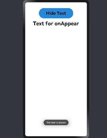
import prompt from '@ohos.prompt' @Entry @Component struct AppearExample { @State isShow: boolean = true private myText: string = 'Text for onAppear' private changeAppear: string = 'Hide Text' build() { Column() { Button() { Text(this.changeAppear) .fontSize(25) .fontWeight(FontWeight.Bold) } .height(60) .width(200) .margin(10) .onClick(() => { this.isShow = !this.isShow }) .margin(3) .backgroundColor(0x2788D9) if (this.isShow) { Text(this.myText) .fontSize(30) .fontWeight(FontWeight.Bold) .margin(10) .onAppear(() => { this.changeAppear = 'Show Text' prompt.showToast({ message: 'The text is shown', duration: 2000 }) }) .onDisAppear(() => { this.changeAppear = 'Hide Text' prompt.showToast({ message: 'The text is hidden', duration: 2000 }) }) } } .padding(30) .width('100%') } }

拖拽事件
拖拽事件指被长按后拖拽时触发的事件。
| 事件名称 | 支持冒泡 | 功能描述 | 说明 |
|---|---|---|---|
| onDragStart(callback: (event: DragEvent, extraParams?: string) => CustomBuilder | 否 | 第一次拖拽此事件绑定的组件时,触发回调。 event:拖拽事件信息,包括拖拽点坐标。 extraParams:拖拽事件额外信息。 返回值:当前跟手效果所拖拽的对象,用于显示拖拽时的提示组件。 | 长按150毫秒(ms)可触发拖拽事件。优先级:长按手势配置时间小于等于150毫秒(ms)时,长按手势优先触发,否则拖拽事件优先触发。 |
| onDragEnter(callback: (event: DragEvent, extraParams?: string) => void) | 否 | 拖拽进入组件范围内时,触发回调。 event:拖拽事件信息,包括拖拽点坐标。 extraParams:拖拽事件额外信息。 | 当监听了onDrop事件时,此事件才有效。 |
| onDragMove(callback: (event: DragEvent, extraParams?: string) => void) | 否 | 拖拽在组件范围内移动时,触发回调。 event:拖拽事件信息,包括拖拽点坐标。 extraParams:拖拽事件额外信息。 | 当监听了onDrop事件时,此事件才有效。 |
| onDragLeave(callback: (event: DragEvent, extraParams?: string) => void) | 否 | 拖拽离开组件范围内时,触发回调。 event:拖拽事件信息,包括拖拽点坐标。 extraParams:拖拽事件额外信息。 | 当监听了onDrop事件时,此事件才有效。 |
| onDrop(callback: (event: DragEvent, extraParams?: string) => void) | 否 | 绑定此事件的组件可作为拖拽释放目标,当在本组件范围内停止拖拽行为时,触发回调。 event:拖拽事件信息,包括拖拽点坐标。 extraParams:拖拽事件额外信息。 | - |
CustomBuilder类型
组件属性方法参数可使用CustomBuilder类型来自定义UI描述。
| 名称 | 类型定义 | 描述 |
|---|---|---|
| CustomBuilder | () => any | 这种方法类型必须使用@Builder装饰器修饰。 |
-
extraParam说明
用于返回组件在拖拽中需要用到的额外信息。 extraParam是Json对象转换的string字符串,可以通过Json.parse转换的Json对象获取如下属性。
| 属性名称 | 属性类型 | 描述 | 说明 |
|---|---|---|---|
| selectedIndex | number | 当拖拽事件设在父容器的子元素时,selectedIndex表示当前被拖拽子元素是父容器第selectedIndex个子元素,selectedIndex从0开始。 | 仅在ListItem组件中生效。 |
| insertIndex | number | 当前拖拽元素在List组件中放下时,insertIndex表示被拖拽元素插入该组件的第insertIndex个位置,insertIndex从0开始。 | 仅在List组件的拖拽事件中生效。 |
DragEvent对象说明
-
接口
| 名称 | 返回值类型 | 功能描述 |
|---|---|---|
| getX() | number | 当前拖拽点x轴坐标,单位为vp |
| getY() | number | 当前拖拽点y轴坐标,单位为vp。 |
示例
@Entry @Component struct DragExample { @State numbers: string[] = ['one', 'two', 'three', 'four', 'five', 'six'] @State text: string = '' @State bool: boolean = false @State bool1: boolean = false @State appleVisible: Visibility = Visibility.Visible @State orangeVisible: Visibility = Visibility.Visible @State bananaVisible: Visibility = Visibility.Visible @State select: number = 0 @Builder pixelMapBuilder() { Column() { Text(this.text) .width('50%') .height(60) .fontSize(25) .borderRadius(10) .textAlign(TextAlign.Center) .backgroundColor(Color.Yellow) } } build() { Column() { Text('There are three Text elements here') .fontSize(25) .fontWeight(FontWeight.Bold) .width('90%') .textAlign(TextAlign.Start) .margin(5) Flex({ direction: FlexDirection.Row, alignItems: ItemAlign.Center, justifyContent: FlexAlign.SpaceAround }) { Text('apple') .width('25%') .height(35) .fontSize(25) .fontWeight(FontWeight.Bold) .textAlign(TextAlign.Center) .backgroundColor(0xAFEEEE) .visibility(this.appleVisible) .onDragStart(() => { this.bool = true this.text = 'apple' this.appleVisible = Visibility.Hidden return this.pixelMapBuilder }) Text('orange') .width('25%') .height(35) .fontSize(25) .fontWeight(FontWeight.Bold) .textAlign(TextAlign.Center) .backgroundColor(0xAFEEEE) .visibility(this.orangeVisible) .onDragStart(() => { this.bool = true this.text = 'orange' this.orangeVisible = Visibility.Hidden return this.pixelMapBuilder }) Text('banana') .width('25%') .height(35) .fontSize(25) .fontWeight(FontWeight.Bold) .textAlign(TextAlign.Center) .backgroundColor(0xAFEEEE) .visibility(this.bananaVisible) .onDragStart((event: DragEvent, extraParams: string) => { console.log('Text onDragStarts, ' + extraParams) this.bool = true this.text = 'banana' this.bananaVisible = Visibility.Hidden return this.pixelMapBuilder }) }.border({ width: 1 }).width('90%').padding({ top: 10, bottom: 10 }).margin(10) Text('This is a List element') .fontSize(25) .fontWeight(FontWeight.Bold) .width('90%') .textAlign(TextAlign.Start) .margin(15) List({ space: 20, initialIndex: 0 }) { ForEach(this.numbers, (item) => { ListItem() { Text('' + item) .width('100%') .height(80) .fontSize(25) .fontWeight(FontWeight.Bold) .borderRadius(10) .textAlign(TextAlign.Center) .backgroundColor(0xAFEEEE) } .onDragStart((event: DragEvent, extraParams: string) => { console.log('ListItem onDragStarts, ' + extraParams) var jsonString = JSON.parse(extraParams) this.bool1 = true this.text = this.numbers[jsonString.selectedIndex] this.select = jsonString.selectedIndex return this.pixelMapBuilder }) }, item => item) } .editMode(true) .height('50%') .width('90%') .border({ width: 1 }) .divider({ strokeWidth: 2, color: 0xFFFFFF, startMargin: 20, endMargin: 20 }) .onDragEnter((event: DragEvent, extraParams: string) => { console.log('List onDragEnter, ' + extraParams) }) .onDragMove((event: DragEvent, extraParams: string) => { console.log('List onDragMove, ' + extraParams) }) .onDragLeave((event: DragEvent, extraParams: string) => { console.log('List onDragLeave, ' + extraParams) }) .onDrop((event: DragEvent, extraParams: string) => { var jsonString = JSON.parse(extraParams) if (this.bool) { this.numbers.splice(jsonString.insertIndex, 0, this.text) this.bool = false } else if (this.bool1) { this.numbers.splice(jsonString.selectedIndex, 1) this.numbers.splice(jsonString.insertIndex, 0, this.text) this.bool = false this.bool1 = false } }) } .width('100%') .height('100%') .padding({ top: 20 }) .margin({ top: 20 }) } }


按键事件
按键事件指组件与键盘、遥控器等按键设备交互时触发的事件。
| 事件名称 | 支持冒泡 | 功能描述 |
|---|---|---|
| onKeyEvent(event: (event?: KeyEvent) => void) | 是 | 按键动作触发该方法调用。 |
KeyEvent对象说明
| 属性 | 类型 | 描述 |
|---|---|---|
| type | KeyType | 按键的类型。 |
| keyCode | number | 按键的键码。 |
| keyText | string | 按键的键值。 |
| keySource | KeySource | 触发当前按键的输入设备类型。 |
| deviceId | number | 触发当前按键的输入设备ID。 |
| metaKey | number | 按键发生时元键的状态,1表示按压态,0表示未按压态。 |
| timestamp | number | 按键发生时的时间戳。 |
| 接口名称 | 功能描述 |
|---|---|
| stopPropagation(): void | 阻塞事件冒泡传递。 |
-
KeyType枚举说明
| 名称 | 描述 |
|---|---|
| Down | 按键按下。 |
| Up | 按键松开。 |
-
KeySource枚举说明
| 名称 | 描述 |
|---|---|
| Unknown | 输入设备类型未知。 |
| Keyboard | 输入设备类型为键盘。 |
-
常用KeyCode说明
| 数值 | 行为 | 物理按键 |
|---|---|---|
| 19 | 上 | 向上方向键。 |
| 20 | 下 | 向下方向键。 |
| 21 | 左 | 向左方向键。 |
| 22 | 右 | 向右方向键。 |
| 23 | 确定 | 遥控器的确认键。 |
| 66 | 确定 | 键盘的回车键。 |
| 160 | 确定 | 键盘的小键盘回车键。 |
示例
@Entry @Component struct KeyEventExample { @State text: string = '' @State eventType: string = '' build() { Column() { Button() { Text('KeyEvent') .fontSize(25) .fontWeight(FontWeight.Bold) } .height(60) .width(200) .margin(10) .backgroundColor(0x2788D9) .onKeyEvent((event: KeyEvent) => { if (event.type === KeyType.Down) { this.eventType = 'Down' } if (event.type === KeyType.Up) { this.eventType = 'Up' } console.info(this.text = 'KeyType:' + this.eventType + '\nkeyCode:' + event.keyCode + '\nkeyText:' + event.keyText) }) Text(this.text) .fontSize(30) .fontWeight(FontWeight.Bold) .padding(15) } .height('100%') .width('100%') .padding(35) } }
选中Button组件,按住和松开Tab键或"`~"符号键触发按键事件。


焦点事件
焦点事件指页面焦点在组件间移动时触发的事件,组件可使用焦点事件来更改内容。
说明:目前仅支持通过外接键盘的tab键、方向键触发。
事件
| 名称 | 支持冒泡 | 功能描述 |
|---|---|---|
| onFocus(callback: () => void) | 否 | 当前组件获取焦点时触发的回调。 |
| onBlur(callback:() => void) | 否 | 当前组件失去焦点时触发的回调。 |
说明:支持焦点事件的组件:Button、Text、Image、List、Grid。
示例
@Entry @Component struct FocusEventExample { @State textOne: string = '' @State textTwo: string = '' @State textThree: string = '' @State oneButtonColor: string = '#FF0000' @State twoButtonColor: string = '#87CEFA' @State threeButtonColor: string = '#90EE90' build() { Column({ space: 20 }) { Button() { Text(this.textOne) .fontSize(20) .fontWeight(FontWeight.Bold) } .backgroundColor(this.oneButtonColor) .width(260) .height(70) .fontColor(Color.Black) .focusable(true) .onFocus(() => { this.textOne = 'First Button onFocus' this.oneButtonColor = '#AFEEEE' }) .onBlur(() => { this.textOne = 'First Button onBlur' this.oneButtonColor = '#FFC0CB' }) Button() { Text(this.textTwo) .fontSize(20) .fontWeight(FontWeight.Bold) } .backgroundColor(this.twoButtonColor) .width(260) .height(70) .fontColor(Color.Black) .focusable(true) .onFocus(() => { this.textTwo = 'Second Button onFocus' this.twoButtonColor = '#00FF00' }) .onBlur(() => { this.textTwo = 'Second Button onBlur' this.twoButtonColor = '#33FFFF' }) Button() { Text(this.textThree) .fontSize(20) .fontWeight(FontWeight.Bold) } .backgroundColor(this.threeButtonColor) .width(260) .height(70) .fontColor(Color.Black) .focusable(true) .onFocus(() => { this.textThree = 'Third Button onFocus' this.threeButtonColor = '#AFEEEE' }) .onBlur(() => { this.textThree = 'Third Button onBlur' this.threeButtonColor = '#FFC0CB' }) } .width('100%') .margin({ top: 20 }) } }
选中Button组件,按Tab键进行走焦。

鼠标事件
在单个动作触发多个事件时,事件的顺序是固定的,鼠标事件默认透传。
| 事件名称 | 支持冒泡 | 描述 |
|---|---|---|
| onHover(callback: (isHover: boolean) => void) | 否 | 鼠标进入或退出组件时触发该回调。 isHover:表示鼠标是否悬浮在组件上,鼠标进入时为true, 退出时为false。 |
| onMouse(callback: (event?: MouseEvent) => void) | 是 | 当前组件被鼠标按键点击时或者鼠标在组件上移动时,触发该回调,event参数包含触发事件时的时间戳、鼠标按键、动作、点击触点在整个屏幕上的坐标和点击触点相对于当前组件的坐标。 |
MouseEvent对象说明
| 属性名称 | 属性类型 | 描述 |
|---|---|---|
| timestamp | number | 触发事件时的时间戳。 |
| screenX | number | 点击触点相对于屏幕左上角的x轴坐标。 |
| screenY | number | 点击触点相对于屏幕左上角的y轴坐标。 |
| x | number | 点击触点相对于当前组件左上角的x轴坐标。 |
| y | number | 点击触点相对于当前组件左上角的y轴坐标。 |
| button | MouseButton | 鼠标按键。 |
| action | MouseAction | 事件动作。 |
-
MouseButton类型说明
| 属性名称 | 属性类型 | 描述 |
|---|---|---|
| Left | number | 鼠标左键。 |
| Right | number | 鼠标右键。 |
| Middle | number | 鼠标中键。 |
| Back | number | 鼠标左侧后退键。 |
| Forward | number | 鼠标左侧前进键。 |
| None | number | 无按键。 |
-
MouseAction类型说明
| 属性名称 | 属性类型 | 描述 |
|---|---|---|
| Press | number | 鼠标按键按下。 |
| Release | number | 鼠标按键松开。 |
| Move | number | 鼠标移动。 |
示例
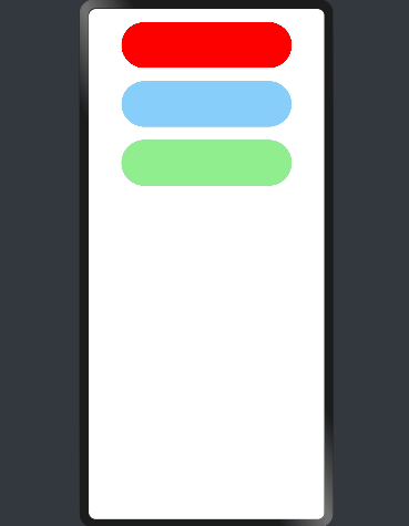
@Entry @Component struct MouseEventExample { @State hoverText: string = 'no hover' @State mouseText: string = 'MouseText' @State color: Color = Color.Red build() { Column({ space: 20 }) { Button() { Text(this.hoverText) .fontSize(25) .fontWeight(FontWeight.Bold) } .height(60) .width(200) .margin(10) .onHover((isHover: boolean) => { if (isHover) { this.hoverText = 'on hover' this.color = Color.Pink } else { this.hoverText = 'no hover' this.color = Color.Blue } }) .backgroundColor(this.color) Button() { Text('onMouse') .fontSize(25) .fontWeight(FontWeight.Bold) } .height(60) .width(200) .margin(10) .onMouse((event: MouseEvent) => { console.log(this.mouseText = 'onMouse:\nButton = ' + event.button + '\nAction = ' + event.action + '\nlocalXY=(' + event.x + ',' + event.y + ')' + '\nscreenXY=(' + event.screenX + ',' + event.screenY + ')') }) Text(this.mouseText) .fontSize(30) .fontWeight(FontWeight.Bold) .margin(10) } .padding({ top: 20 }) .width('100%') } }
在RK3568开发板上进行鼠标事件演示


组件区域变化事件
组件区域变化事件指组件显示的尺寸、位置等发生变化时触发的事件。
| 事件名称 | 支持冒泡 | 功能描述 |
|---|---|---|
| onAreaChange(event: (oldValue: Area, newValue: Area) => void) | 否 | 组件区域变化时触发该回调。 |
示例
@Entry @Component struct AreaExample { @State value: string = 'Text' @State areaSize: string = '' build() { Column() { Text(this.value) .backgroundColor(Color.Green) .margin(30) .fontSize(30) .fontWeight(FontWeight.Bold) .onClick(() => { this.value = this.value + 'Text' }) .onAreaChange((oldValue: Area, newValue: Area) => { console.info(`Ace: on area change, oldValue is ${JSON.stringify(oldValue)} value is ${JSON.stringify(newValue)}`) this.areaSize = JSON.stringify(newValue) }) Text('new area is: \n' + this.size) .fontSize(24) .fontWeight(FontWeight.Bold) .margin({ right: 30, left: 30 }) } .width('100%') .height('100%') .margin({ top: 30 }) } }


组件可见区域变化事件
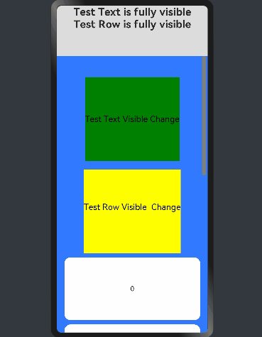
组件可见区域变化事件指组件在屏幕中显示的面积变化,提供了判断组件是否完全或部分显示在屏幕中的能力,通常适用于像广告曝光埋点之类的场景。
事件
| 名称 | 功能描述 |
|---|---|
| onVisibleAreaChange(ratios: Array<number>, event: (isVisible: boolean, currentRatio: number) => void) | 组件可见区域变化时触发该回调。 ratios:阈值数组。其中,每个阈值代表组件可见面积(即组件在屏幕显示区的面积)与组件自身面积的比值。当组件可见面积与自身面积的比值大于或小于阈值时,均会触发该回调。每个阈值的取值范围为[0.0, 1.0],如果开发者设置的阈值超出该范围,则会实际取值0.0或1.0. isVisible:表示组件的可见面积与自身面积的比值是否大于阈值,true表示大于,false表示小于。 currentRatio:触发回调时,组件可见面积与自身面积的比值。 |
示例
@Entry @Component struct ScrollExample { scroller: Scroller = new Scroller() private arr: number[] = [0, 1, 2, 3, 4, 5, 6, 7, 8, 9] @State testTextStr: string = "test" @State testRowStr: string = "test" build() { Column() { Column() { Text(this.testTextStr) .fontSize(25) .fontWeight(FontWeight.Bold) Text(this.testRowStr) .fontSize(25) .fontWeight(FontWeight.Bold) } .height(120) .opacity(0.8) Scroll(this.scroller) { Column() { Text("Test Text Visible Change") .fontSize(20) .height(200) .margin({ top: 50, bottom: 20 }) .backgroundColor(Color.Green) // 通过设置ratios为[0.0, 1.0],实现当组件完全显示或完全消失在屏幕中时触发回调 .onVisibleAreaChange([0.0, 1.0], (isVisible: boolean, currentRatio: number) => { console.info("Test Text isVisible: " + isVisible + ", currentRatio:" + currentRatio) if (isVisible && currentRatio >= 1.0) { console.info("Test Text is fully visible. currentRatio:" + currentRatio) this.testTextStr = "Test Text is fully visible" } if (!isVisible && currentRatio <= 0.0) { console.info("Test Text is completely invisible.") this.testTextStr = "Test Text is completely invisible" } }) Row() { Text("Test Row Visible Change") .fontSize(20) .margin({ bottom: 20 }) } .height(200) .backgroundColor(Color.Yellow) .onVisibleAreaChange([0.0, 1.0], (isVisible: boolean, currentRatio: number) => { console.info("Test Row isVisible:" + isVisible + ", currentRatio:" + currentRatio) if (isVisible && currentRatio >= 1.0) { console.info("Test Row is fully visible.") this.testRowStr = "Test Row is fully visible" } if (!isVisible && currentRatio <= 0.0) { console.info("Test Row is is completely invisible.") this.testRowStr = "Test Row is is completely invisible" } }) ForEach(this.arr, (item) => { Text(item.toString()) .width('90%') .height(150) .backgroundColor(0xFFFFFF) .borderRadius(15) .fontSize(16) .textAlign(TextAlign.Center) .margin({ top: 10 }) }, item => item) }.width('100%') } .backgroundColor(0x317aff) .scrollable(ScrollDirection.Vertical) .scrollBar(BarState.On) .scrollBarColor(Color.Gray) .scrollBarWidth(30) .onScroll((xOffset: number, yOffset: number) => { console.info(xOffset + ' ' + yOffset) }) .onScrollEdge((side: Edge) => { console.info('To the edge') }) .onScrollEnd(() => { console.info('Scroll Stop') }) } .width('100%') .height('100%') .backgroundColor(0xDCDCDC) } }

参考文献
[1]OpenHarmony UI开发.
[2]基于TS扩展的声明式开发范式.

社区规范:仅讨论OpenHarmony相关问题。
更多推荐
 1
1 1
1- 0


 已为社区贡献54条内容

所有评论(0)